Exploration 15 — Fashion store home page layout exploration
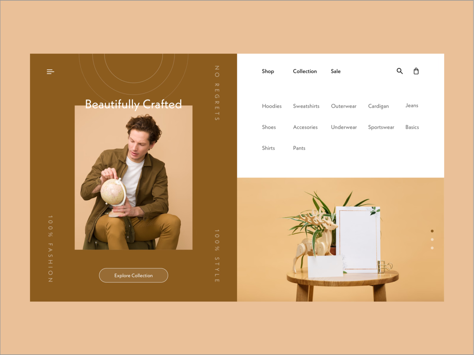
Two halves make up this layout exploration for a fashion store’s home page.
The left half is the brand: a warm brown panel with a large Beautifully Crafted headline over a portrait, short phrases running vertically along the edges and an Explore Collection button. The right half is the shop. The menu is already open, with Shop, Collection and Sale on top and every category, from hoodies and outerwear to shoes and basics, laid out as a simple grid above a still-life photo with slide dots.
Got something real to build?
I join your team as a design partner and stay for the long run, from the first flow to shipped UI.