Exploration 5 — Clearface skincare brand hero exploration
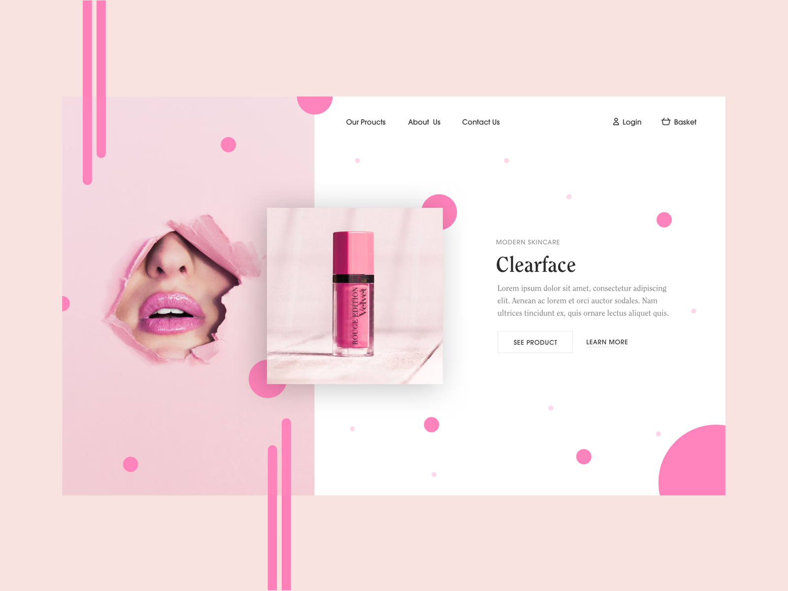
Hero exploration for Clearface, a skincare and beauty brand.
The page splits in two: a pink half with a photo of lips breaking through torn paper, and a white half with the brand name in a serif, placeholder copy and two actions, See Product and Learn More. A product photo sits across the divide and joins the halves. Pink circles and vertical bars scattered over both sides carry the color through the layout.
Got something real to build?
I join your team as a design partner and stay for the long run, from the first flow to shipped UI.