Lepaya Final Logo — Lepaya logo finalists for corporate learning app
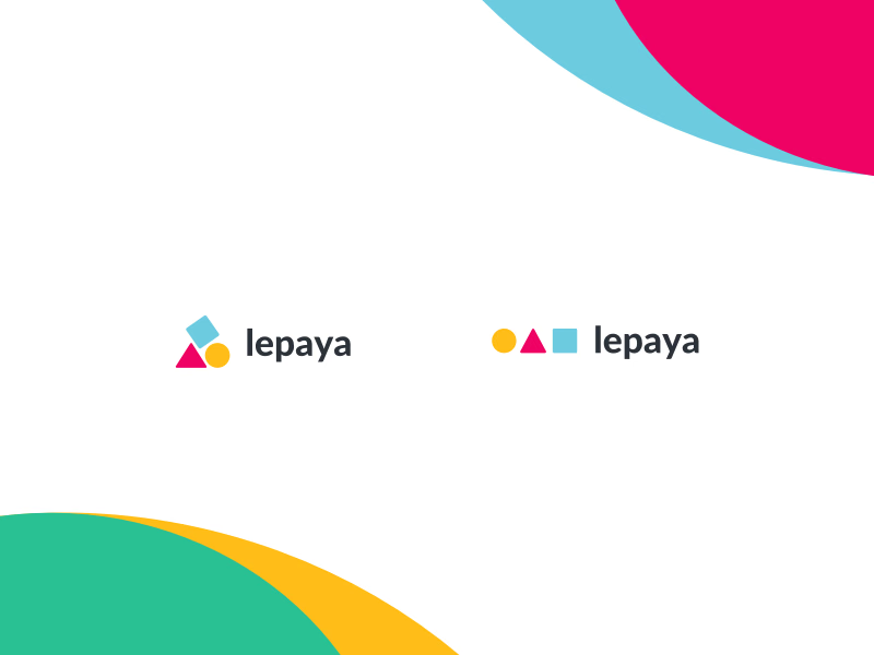
The two finalists for the Lepaya logo, with the one on the left chosen. Lepaya is an app that lets people in the corporate world take their company’s trainings and workshops on mobile, in a more fun way.
The idea is building: three basic shapes, a circle, a triangle and a square, like the building toys most of us had as kids. In the chosen version they stack on each other; the alternative lines them up in a row. The typeface was changed so the wordmark matches the rest of the brand identity.
Got something real to build?
I join your team as a design partner and stay for the long run, from the first flow to shipped UI.