Updated Shosho website — Bento features section for the updated Shosho website
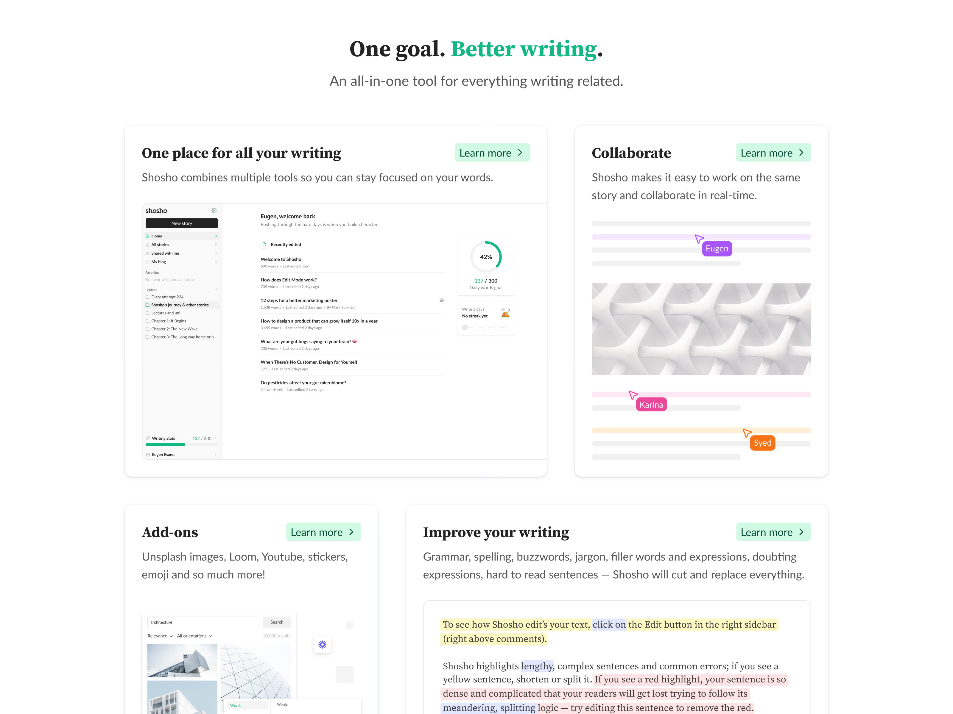
The features section of Shosho’s updated website, under the headline One goal. Better writing.
A bento grid gives each feature its own card, sized by how much there is to show. One place for all your writing gets the widest card and a screenshot of the app’s home. Collaborate uses named cursors (Eugen, Karina, Syed) on an abstract page to show several people working on the same story in real time. Add-ons and Improve your writing follow underneath.
Every card carries the same green Learn more button in its top-right corner.
Got something real to build?
I join your team as a design partner and stay for the long run, from the first flow to shipped UI.