Watchlist - Exploration 1 — Brand trend comparison watchlist exploration for Spate
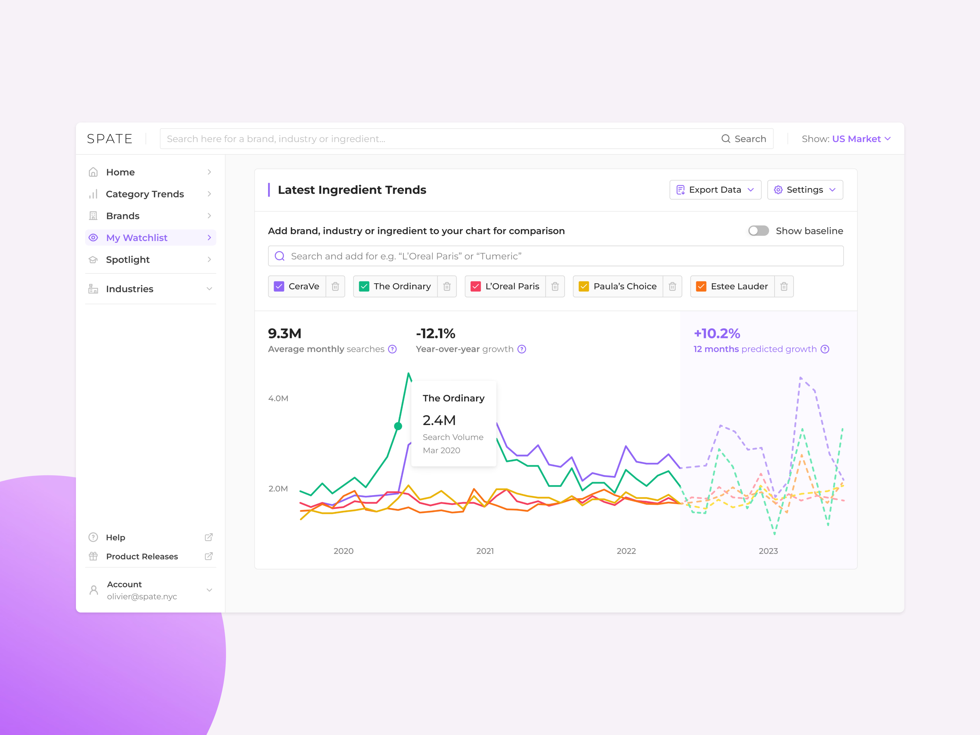
The first watchlist exploration for Spate, built around comparing trends on one chart.
A search field above the chart adds a brand, industry or ingredient for comparison, and each one becomes a colored chip that can be removed. Hovering a line shows a tooltip with the exact search volume for that month, and a baseline switch sits in the corner. The headline numbers (average monthly searches, year-over-year growth and 12-month predicted growth) stay above the chart, and the forecast is drawn as dashed lines on a shaded panel.
Got something real to build?
I join your team as a design partner and stay for the long run, from the first flow to shipped UI.