Calendar meeting details - layout exploration — Interview details popover layout exploration for Teero
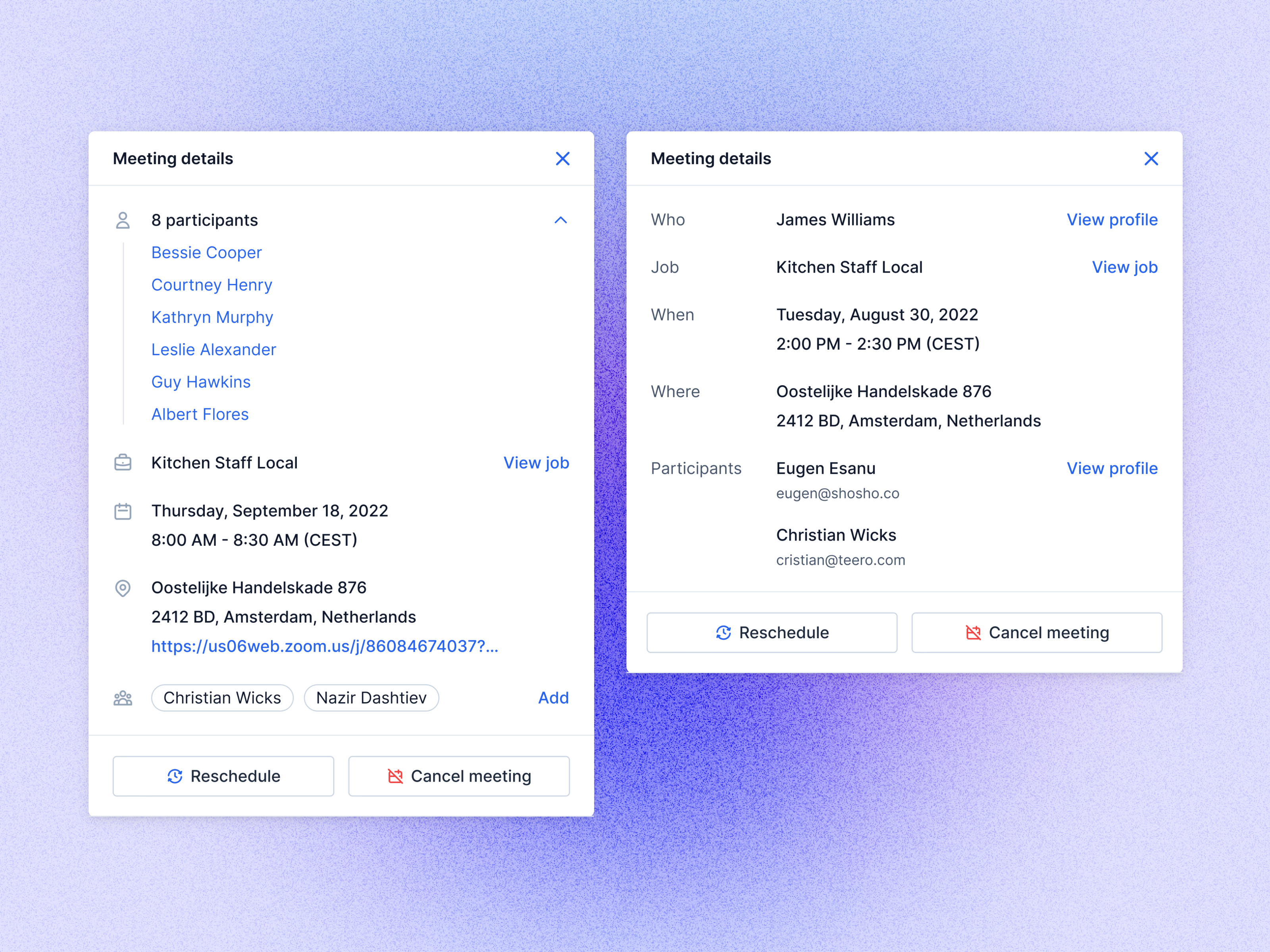
Two layout explorations for the meeting details popover in Teero’s calendar.
The left version runs on icons and leads with participants, in a list that collapses when there are many (eight in this example). Then come the job, date and time, address with video link, and interviewers as chips with an Add link. The right version uses a label column (Who, Job, When, Where, Participants) and puts View profile and View job links on the right edge. Both end with the same two actions, Reschedule and Cancel meeting.
Got something real to build?
I join your team as a design partner and stay for the long run, from the first flow to shipped UI.