Chart exploration (1) — Product usage forecast and Venn chart exploration
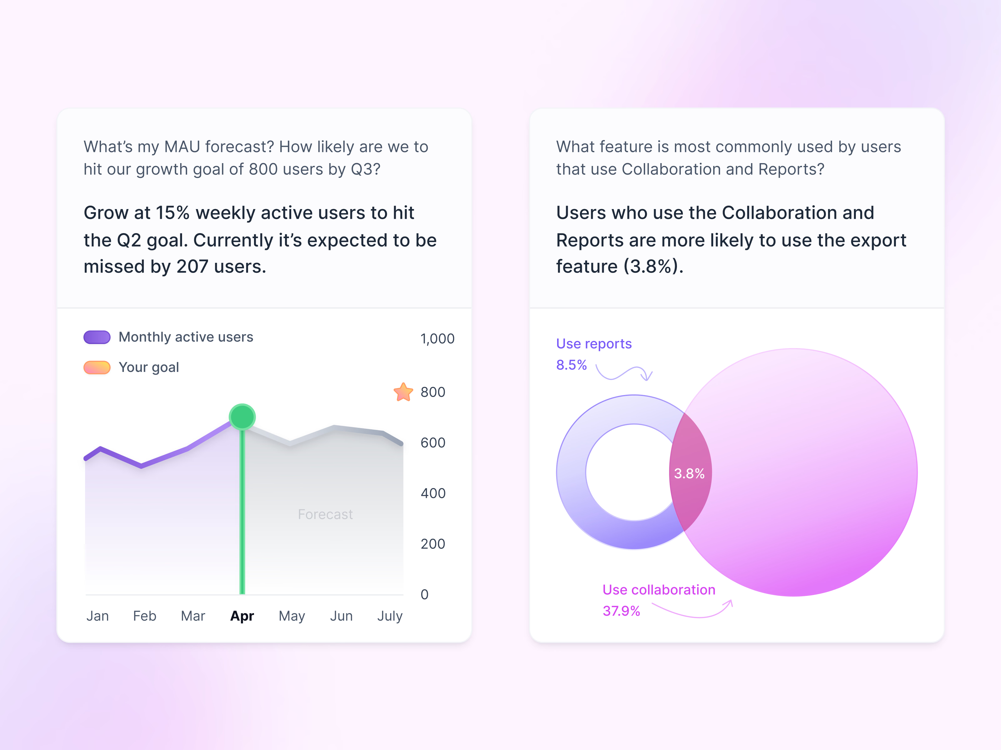
Two more chart explorations, each answering a question about product usage.
The left card asks how likely a growth goal is to be hit. Its line chart shows monthly active users up to April in purple, then a gray forecast area for the months ahead, with the goal marked by a star on the axis. The right card asks which feature people who use collaboration and reports also turn to, and answers with two overlapping circles, the shared share labeled in the middle. The numbers are example data.
Got something real to build?
I join your team as a design partner and stay for the long run, from the first flow to shipped UI.