Chart exploration (2) — Revenue waterfall and user type chart exploration
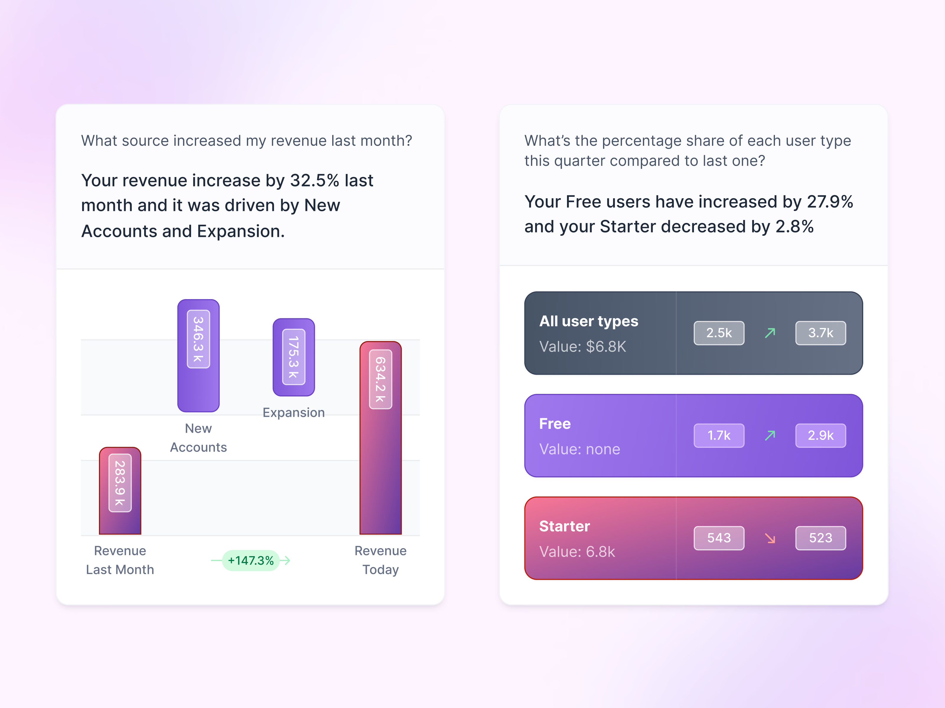
Chart explorations for answers about revenue and user types.
Each card pairs a question with a short written answer and a chart. The left one shows where last month’s revenue growth came from as a waterfall: last month’s revenue, new accounts, expansion and today’s revenue, with a green percentage badge between the ends. The right one swaps the chart for three colored rows, all user types, free and starter, each with last quarter’s and this quarter’s values and an arrow showing which way it moved. The figures are example data.
Got something real to build?
I join your team as a design partner and stay for the long run, from the first flow to shipped UI.