Charts exploration (3) — Funnel and feature usage bubble chart exploration
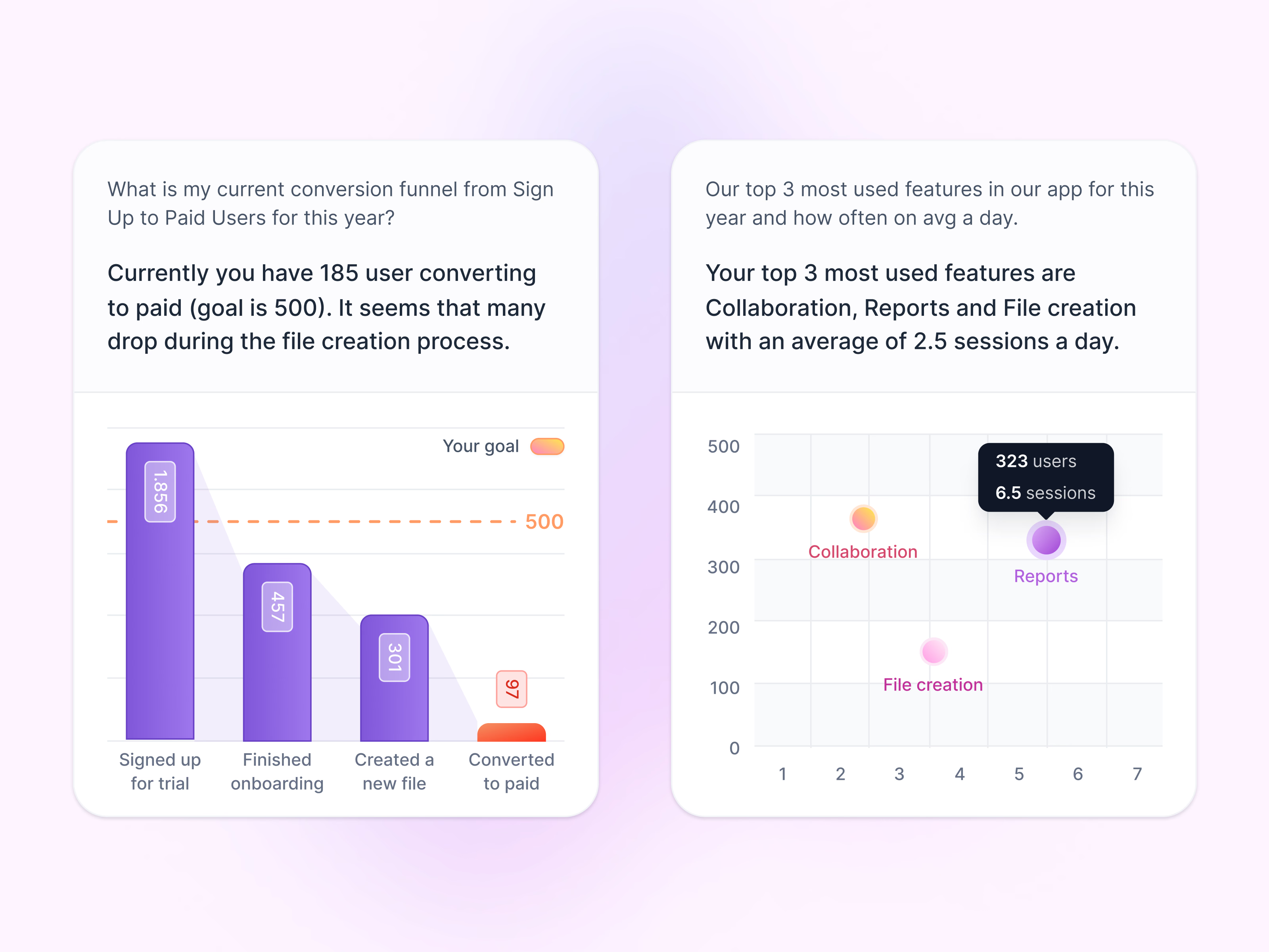
Another round of chart explorations, built around questions people ask about their product data.
Each card follows the same order: the question, a one-sentence answer in larger type, then the chart that backs it up. On the left, a funnel from trial sign-up to paid with a dashed goal line. On the right, a bubble chart of the most used features, with a dark tooltip showing users and sessions for Reports. Leading with the answer means the sentence is often enough, and the chart is there for anyone who wants to check.
Got something real to build?
I join your team as a design partner and stay for the long run, from the first flow to shipped UI.