Chart — Births per year infographic with country line chart
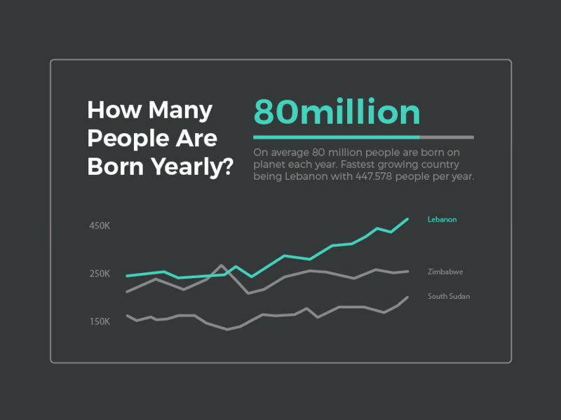
An infographic that started with a question on my mind: how many people are born each year?
The question takes the left side in big white type. Opposite, a single large figure in teal answers it, with a thin progress bar and a short note naming the fastest-growing country. Below, a line chart compares three countries over time, with the leader in teal and the others in gray, so the comparison is clear without a legend.
Got something real to build?
I join your team as a design partner and stay for the long run, from the first flow to shipped UI.