Employee Departments Chart — Employee departments donut chart states for Apollo
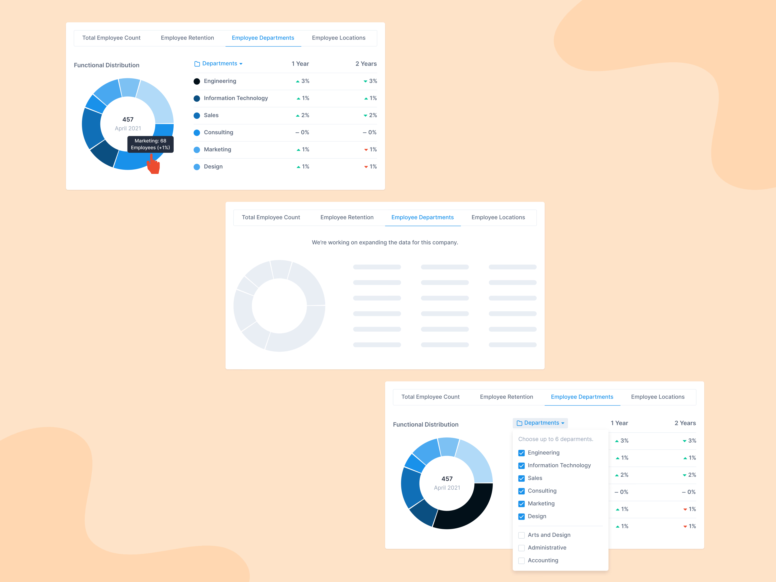
Three states of the Employee Departments tab in a company’s employee metrics in Apollo. A donut shows the functional distribution with the total headcount in the middle, and a table beside it lists each department’s change over one and two years. Hovering a slice shows that department’s headcount and change.
When there isn’t enough data, the layout stays and turns into a gray skeleton with a short note that data for the company is being expanded. The Departments menu lets you choose up to six departments to compare.
Got something real to build?
I join your team as a design partner and stay for the long run, from the first flow to shipped UI.