Finance homepage — Workforce finance home dashboard for Horus
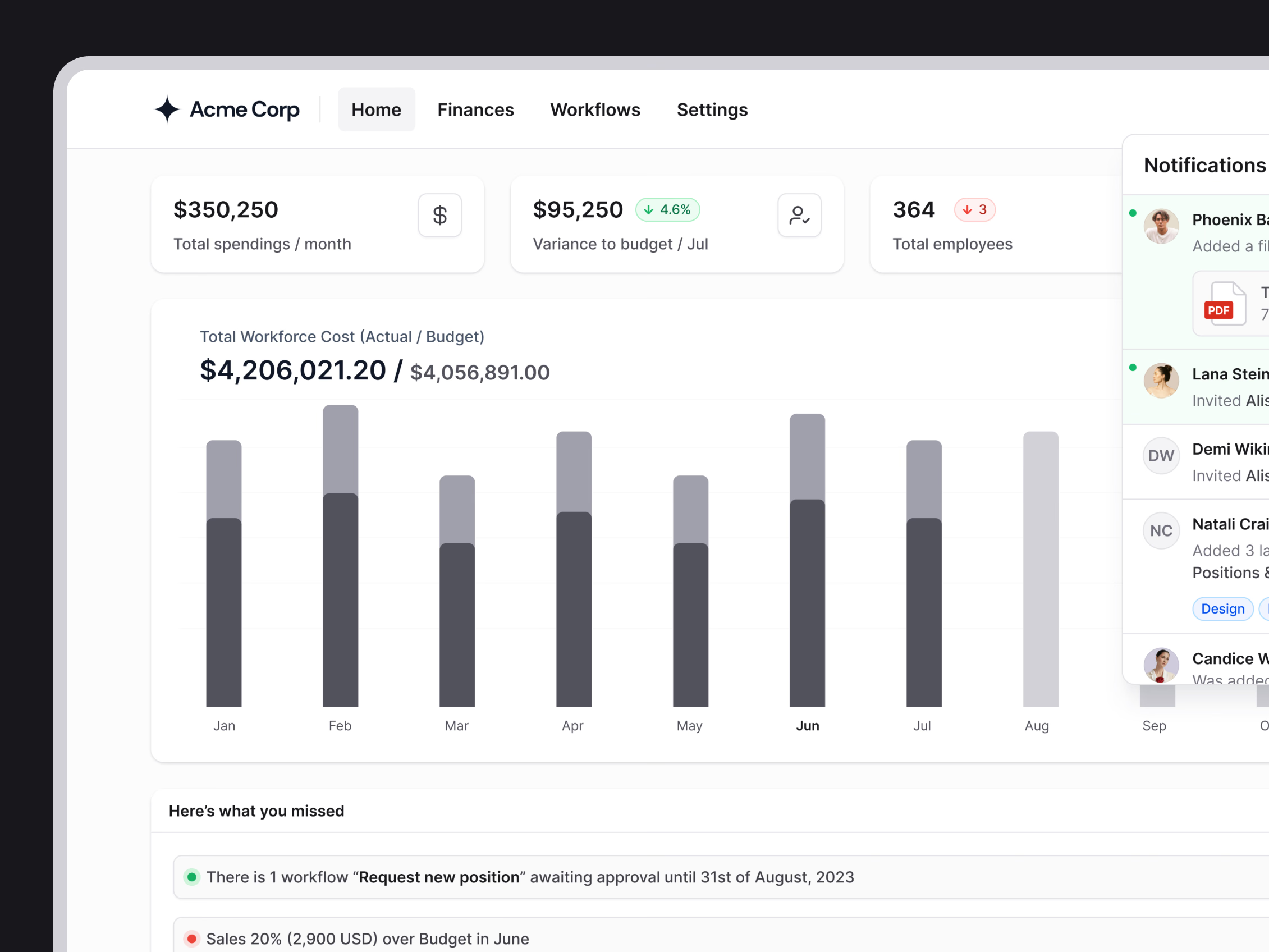
The home dashboard for Horus, where workforce cost, budget and headcount sit on one page.
Three cards open the page: total monthly spend, variance to budget and total employees, each with a small change badge. A bar chart below compares actual workforce cost with budget month by month, and the months still ahead show budget only. Under it, Here’s what you missed lists what needs action, such as a position request waiting for approval or a team over budget. A notifications panel opens on the right.
Got something real to build?
I join your team as a design partner and stay for the long run, from the first flow to shipped UI.