High Level Graphs — High-level chart cards in orange and blue
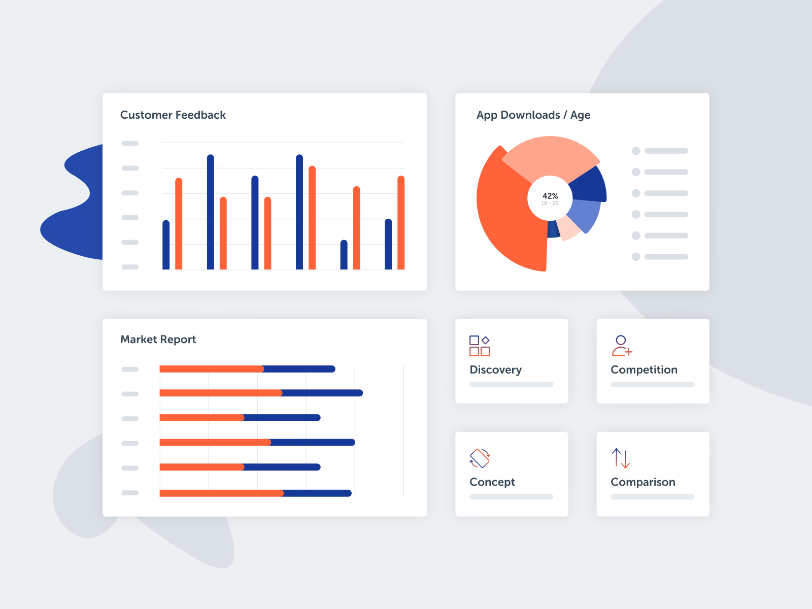
A set of high-level graph cards, drawn without labels or real data so the attention goes to the form of each chart.
Customer Feedback compares two series as paired bars, App Downloads / Age uses a radial chart with one age band called out in the center, and Market Report shows two values per row as horizontal bars. Four smaller tiles with line icons, for discovery, competition, concept and comparison, sit beside them. Two colors, orange and deep blue, carry every chart.
Got something real to build?
I join your team as a design partner and stay for the long run, from the first flow to shipped UI.