Product Visuals — Simplified campaign dashboard product visuals
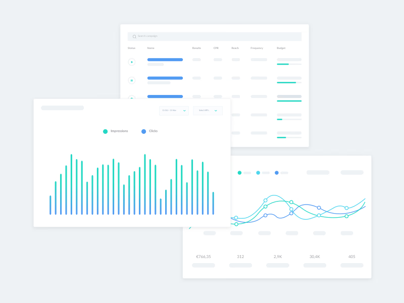
High-level visuals of a campaign dashboard, its tables and charts, each standing for a different part of a larger product project.
Instead of real screenshots, they reduce the interface to its shapes. A campaign table keeps only its columns, status, name, results, CPR, reach, frequency and budget, with play and pause controls and budget bars. A bar chart compares impressions and clicks in a teal-to-blue gradient, and a line chart tracks several metrics above a row of totals. Gray bars stand in for text, so the visuals stay readable at small sizes.
Got something real to build?
I join your team as a design partner and stay for the long run, from the first flow to shipped UI.