Typography Exploration 2 — Bodoni typography exploration for article cards
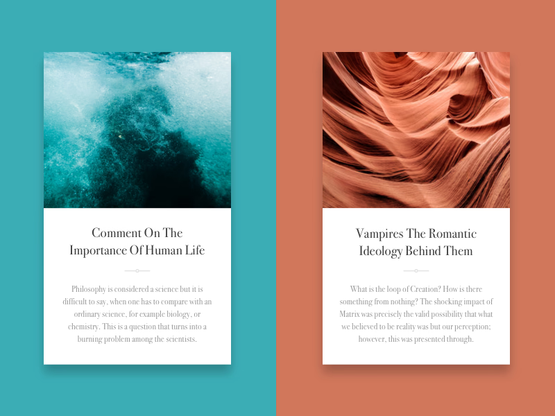
A type exploration that tests Bodoni on article cards for a project, where it became the final choice.
Two article cards test it: a full-bleed photo on top, a centered serif title, a small ornamental divider, then a short excerpt in lighter gray. Each card sits on a color pulled from its photo, teal for the water and terracotta for the canyon, to see how the type holds up next to strong color. Bodoni’s sharp contrast between thick and thin strokes gives the titles an editorial feel.
Got something real to build?
I join your team as a design partner and stay for the long run, from the first flow to shipped UI.