Utilities simplified — Utility sign-up paths section for Public Grid
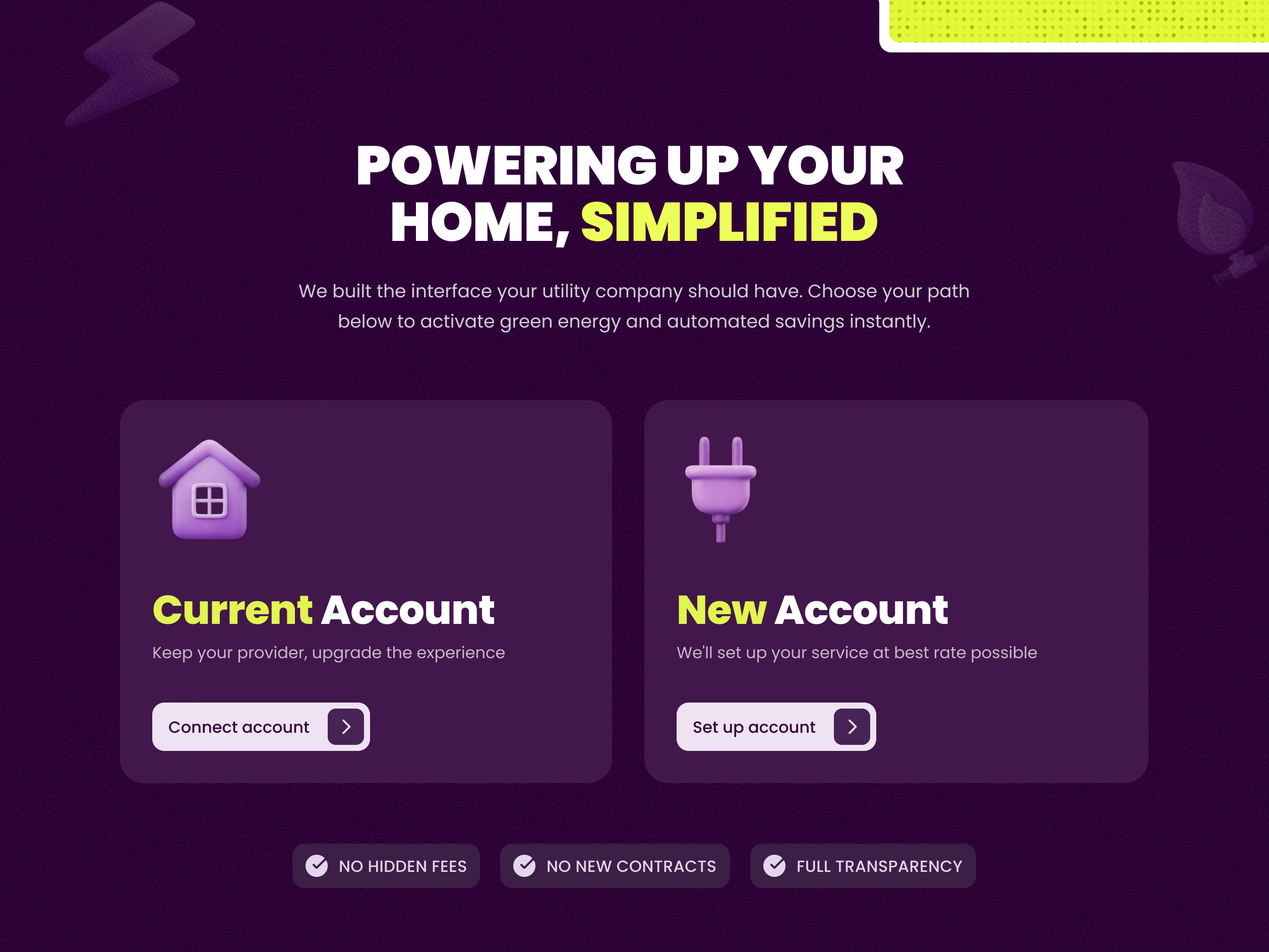
A section for Public Grid that splits sign-up into two clear paths.
Under the headline Powering up your home, simplified, one line sums up the idea: the interface your utility company should have. Then two cards. Current Account is for people who keep their provider and want a better experience, with Connect account. New Account is for people who need service set up, with Set up account. A clay house and a clay plug tell them apart at a glance, and three badges close the section: no hidden fees, no new contracts, full transparency.
Got something real to build?
I join your team as a design partner and stay for the long run, from the first flow to shipped UI.