Utility comparison vs Public Grid — Utility bill comparison slider for Public Grid
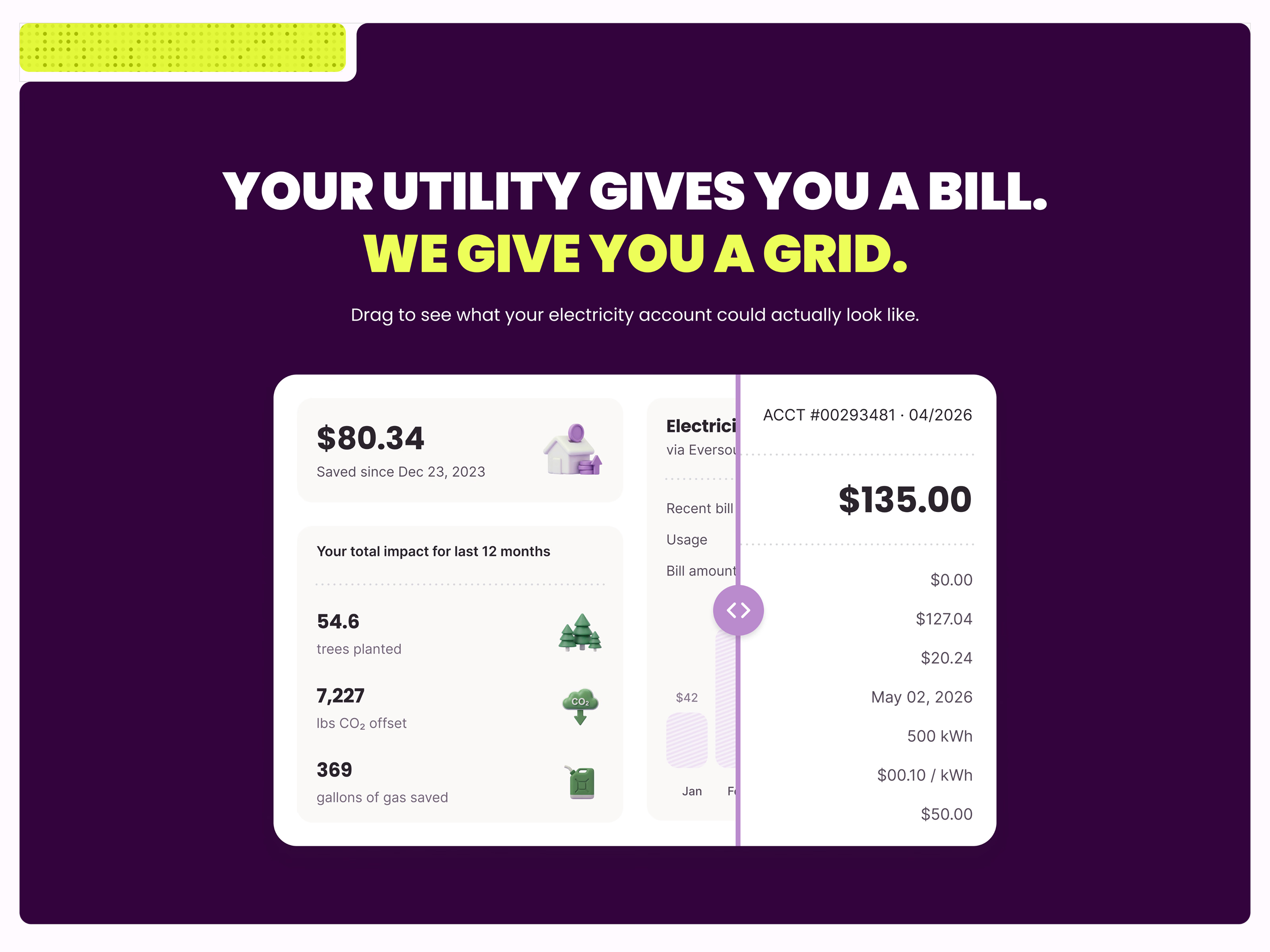
A comparison section for Public Grid’s website, showing the difference between what you get from your utility and what you get from Public Grid. The headline sets it up: your utility gives you a bill, Public Grid gives you a grid. Instead of a wall of copy, a slider runs across one card. You see the bill, you drag, you get it.
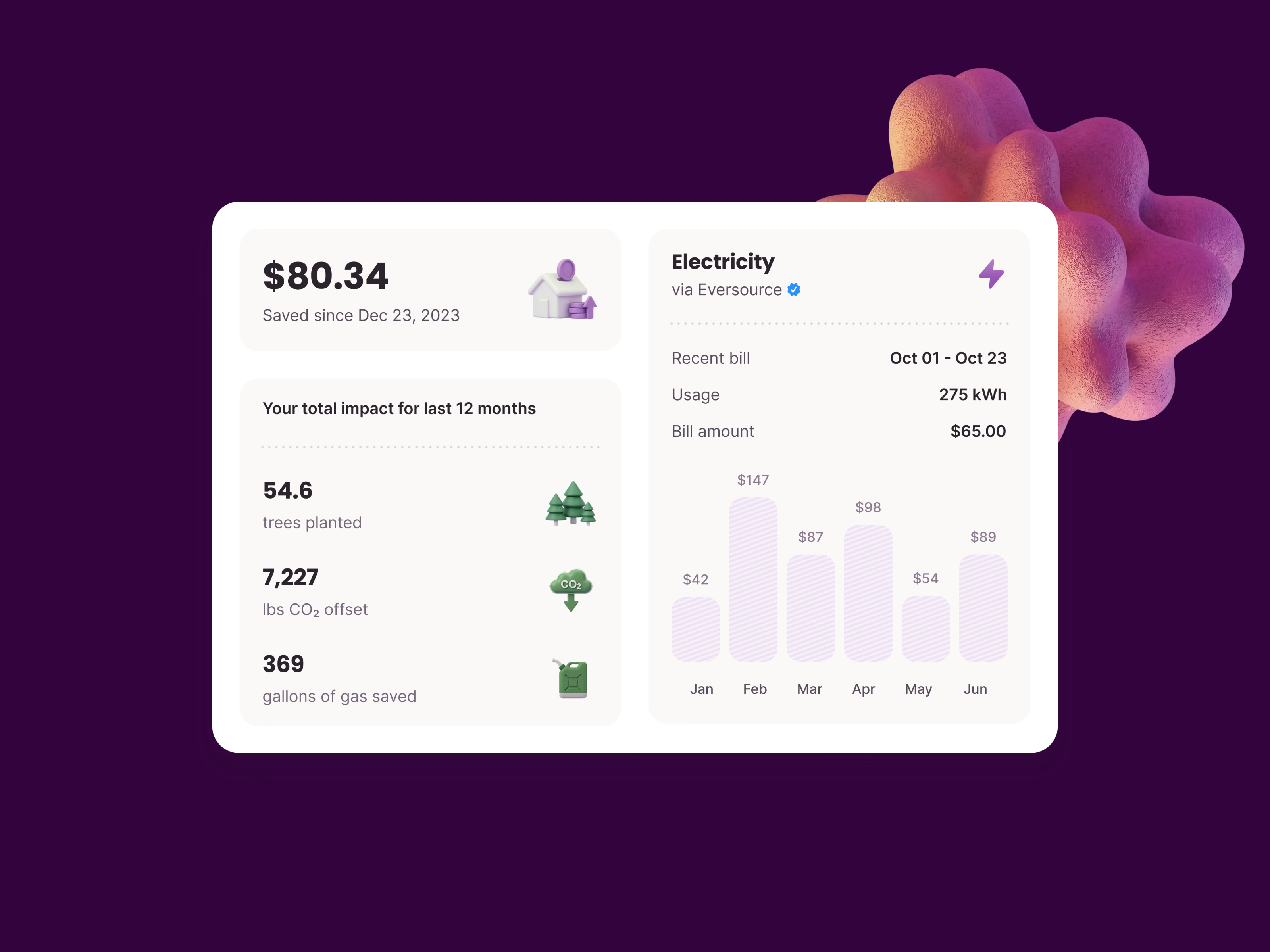
The Public Grid side puts your actual impact, savings and usage in one place: money saved since signing up, the last 12 months as trees planted, pounds of CO₂ offset and gallons of gas saved, and the electricity account from Eversource with the recent bill, usage and a six-month chart.
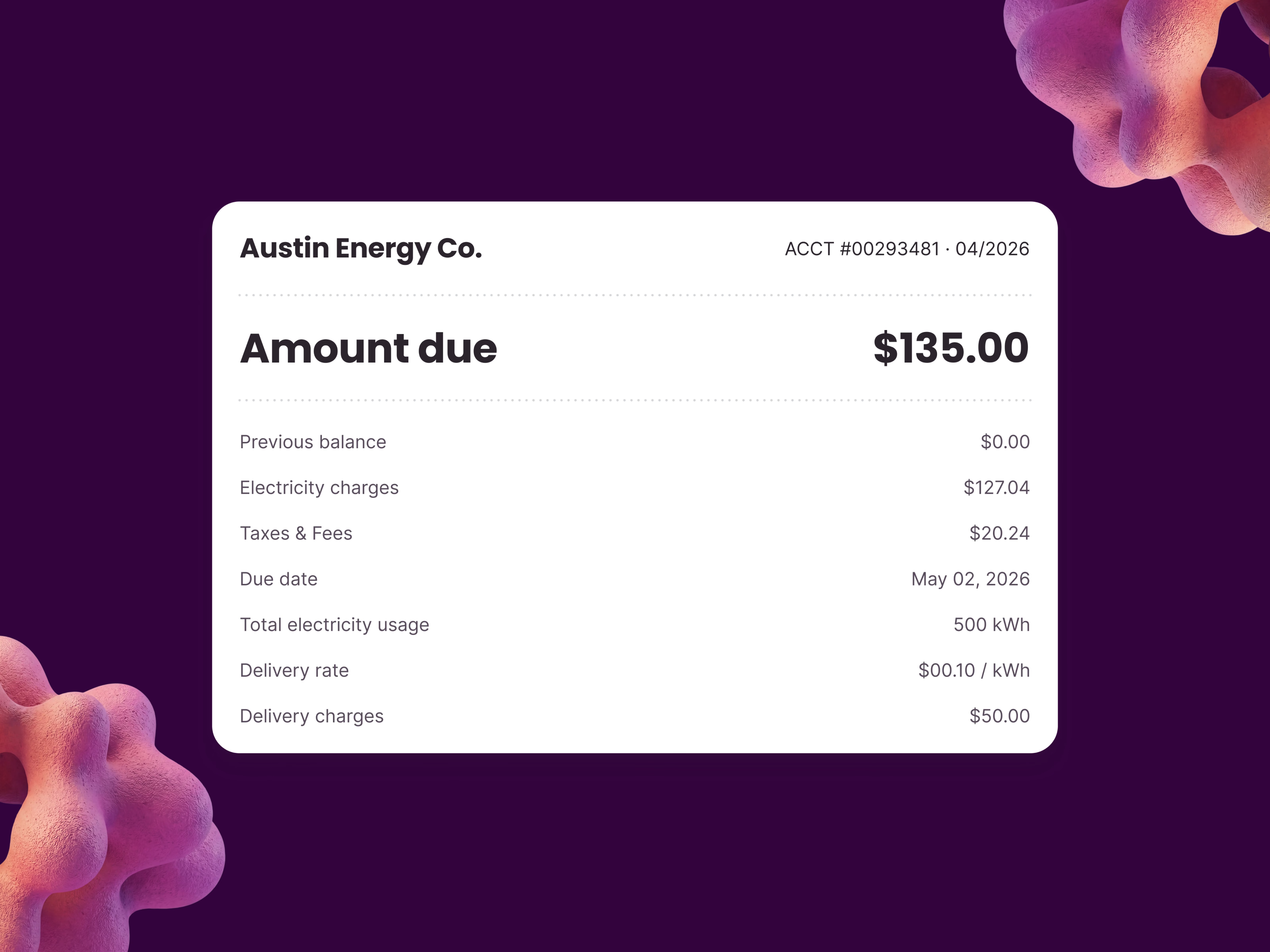
The other side is the bill most people know: an account number, the amount due, then a column of balances, charges, taxes, the due date, usage and delivery rates. Every figure is there, and none of it tells you anything. The amounts on both sides are example data.
Got something real to build?
I join your team as a design partner and stay for the long run, from the first flow to shipped UI.