HelloGov
Experiment by experiment — one small tweak lifted new passport orders 23%.
Overview
HelloGov takes the pain out of getting a U.S. passport: a guided application instead of government forms, document uploads, and tracking until the passport is back in your hands. Behind it, an admin team reviews every application.
The CEO reached out at a pivotal moment. The product had stopped scaling properly: too many moving parts, spread across too many touchpoints. They needed someone who could think in systems and work out how to scale all of it, every touchpoint included.
I worked across all of it — the website, the checkout, the customer portal and the admin tools — and improved it experiment by experiment, from redesigning the whole passport journey to small tweaks. One small tweak alone lifted conversion on new passport orders by 23%. Over the partnership, MRR grew 127% and the monthly refund rate fell from 25.7% to 15.4%, because I fixed the UX issues that were causing refunds.
Small experiments, big lifts
The CEO was wary of touching the application flow. It worked, and he didn’t want to break it. So instead of one big redesign, we changed it experiment by experiment.
The first step asked people to choose a passport service, and it was a wall of text. I suggested adding icons, so each option reads at a glance. It was a small change and the CEO was hesitant, so we ran it as a quick experiment: new passport orders went up 23%. It was one of many. Every change shipped as its own test, and the numbers decided what stayed.
Beyond the product: partnership decks
Being on the team meant more than screens. When HelloGov went after partnerships, the CEO handed me everything they had and asked for the presentations. I designed the pitch decks for CVS, Staples and CLEAR, turning the product, the numbers and the story into a pitch made for each partner.
Results
- MRR
- +127%
- Monthly recurring revenue over the partnership.
- Monthly refund rate
-
25.7%to 15.4% - Cut by fixing the UX issues that were causing refunds.
- New passport orders
- +23%
- Conversion lift from one small tweak, tested as its own experiment.
Fixing the UX behind refunds
A 25.7% monthly refund rate isn’t a support problem — it’s a design problem. So I treated refunds as bug reports: where did people get confused, stuck or surprised? Then I fixed the experience at that exact point, whether it lived in the application, the checkout, the customer portal or the admin behind them. Monthly refunds dropped to 15.4%.
Scope
- Marketing website and guided application
- Checkout with expediting speeds and add-ons
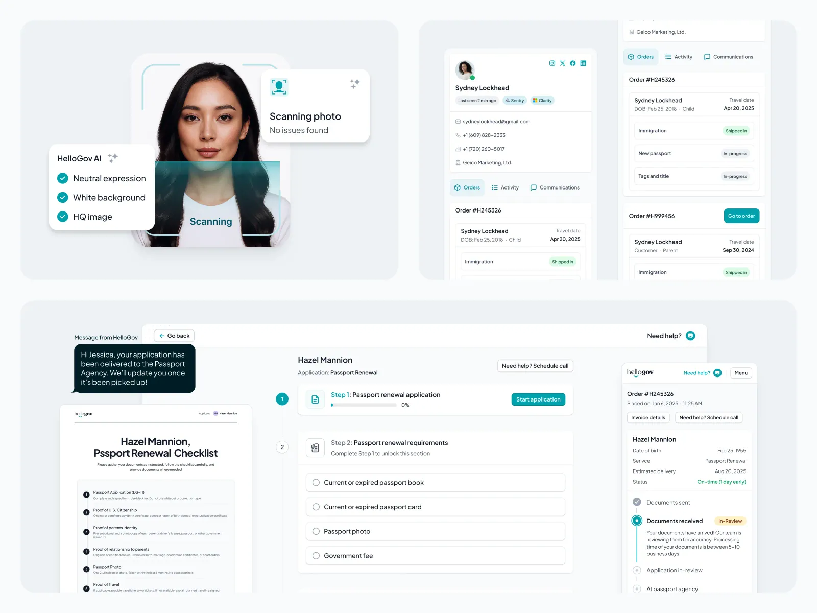
- Document requirements, uploads and AI photo checks
- Customer portal with live order tracking
- One-time-code login, every error and expiry state included
- Admin: orders, customer communications and a refunds dashboard
- Partnership pitch decks for CVS, Staples and CLEAR