Account signal graph — Accounts table with signal graph column in Lantern
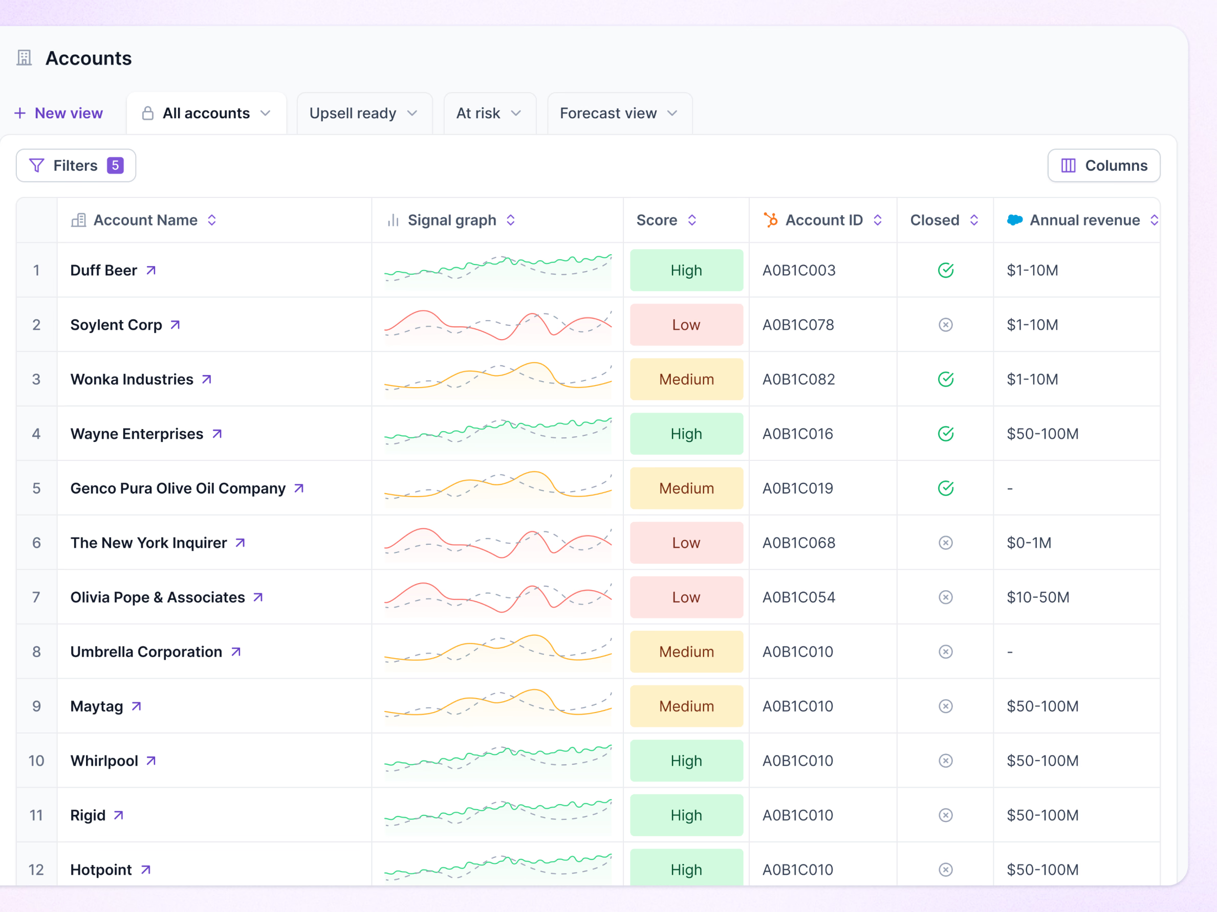
The accounts table in Lantern, with a signal graph column. Each row draws a small line of the account’s recent signals against a dashed baseline, and a High, Medium or Low score next to it gives the verdict in a colored pill.
Saved views run as tabs across the top (all accounts, upsell ready, at risk, forecast view) with a New view button, and Filters shows how many are applied. Columns that come from HubSpot or Salesforce carry the tool’s logo in the header, so it’s clear where each value comes from.
Got something real to build?
I join your team as a design partner and stay for the long run, from the first flow to shipped UI.