Dashboard exploration — ROI dashboard exploration for Lantern's AI CRM
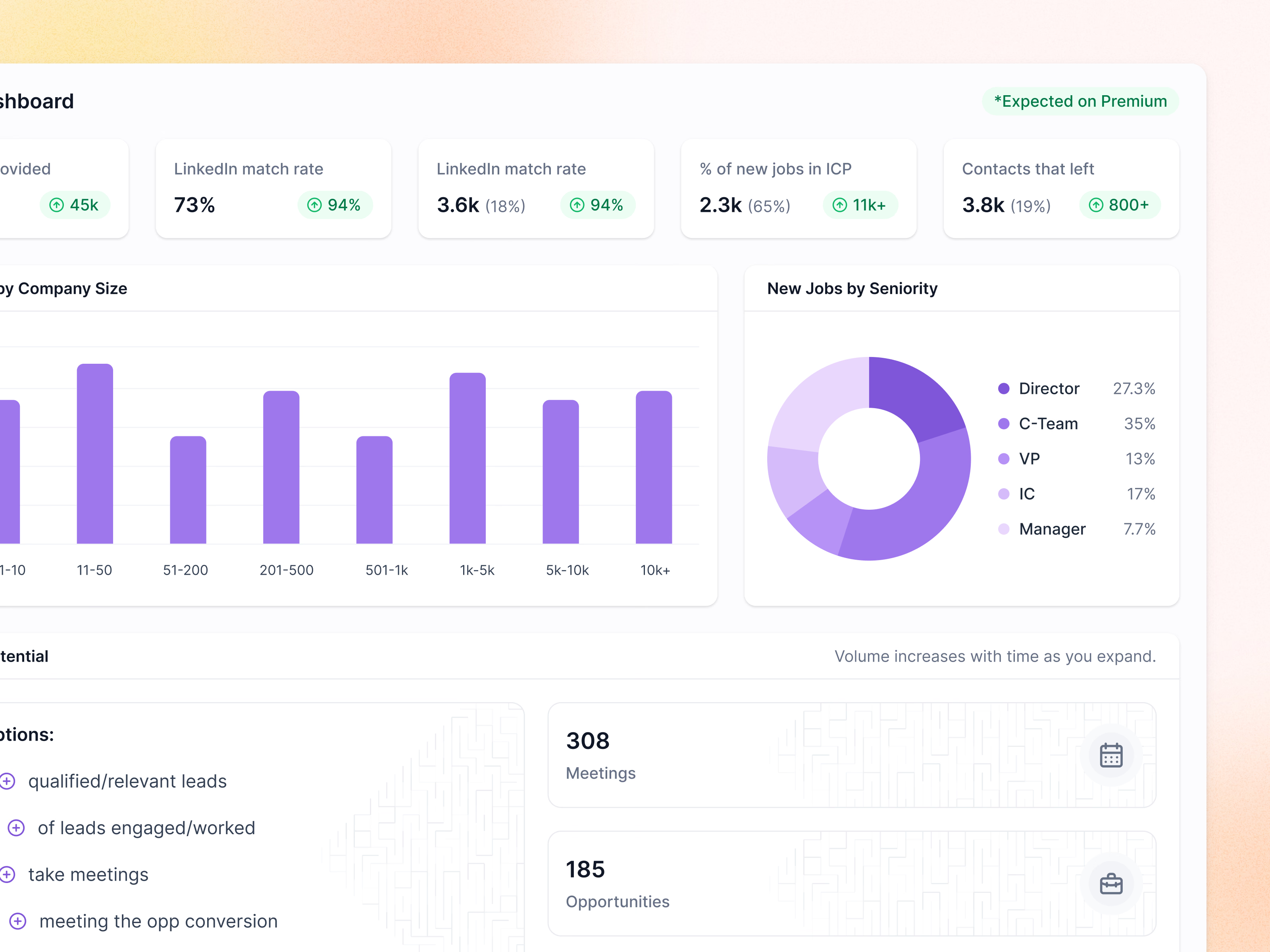
An exploration of Lantern’s ROI dashboard, cropped close to show the detail. Stat cards pair the current number with a green pill for what Premium is expected to add, so the gap between plans reads at a glance.
New jobs by company size sit in a bar chart, and new jobs by seniority in a donut with a percentage beside each level. Under them, pipeline potential turns a set of assumptions into meetings and opportunities, with a note that volume increases over time as you expand. All figures are example data.
Got something real to build?
I join your team as a design partner and stay for the long run, from the first flow to shipped UI.