Font & Color — Serif font and color pairing exploration in Athelas
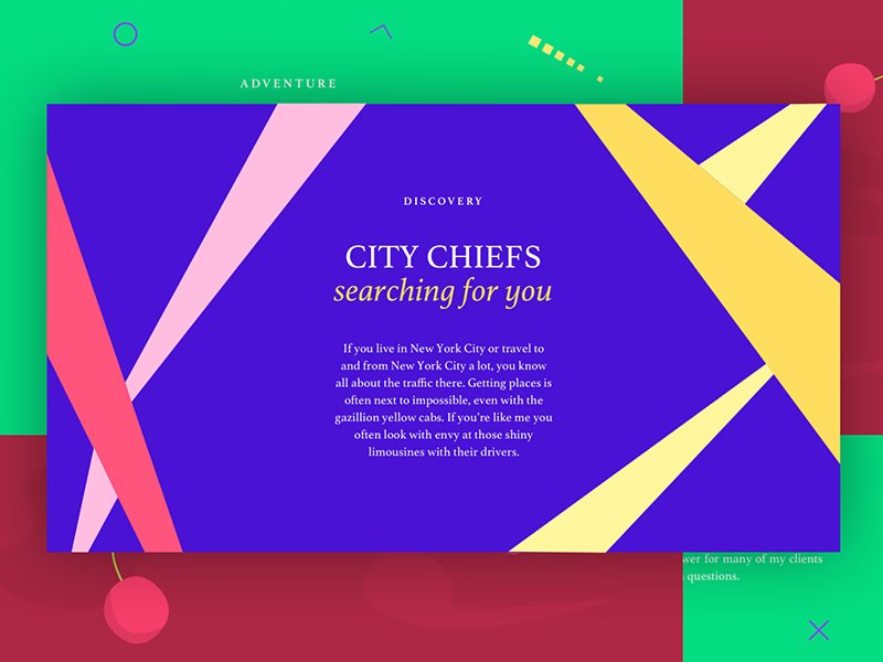
A weekend exploration of font and color, set in Athelas.
The study puts a quiet serif against loud color to see where it holds up. The panels carry the energy, so the type stays restrained and is tested at each size it would need: spaced small capitals for labels like Discovery and Adventure, serif caps with an italic line for the City Chiefs headline, and a short paragraph to check Athelas at body size on a strong background.
Got something real to build?
Tell me what you’re building and let’s see if we’re a good fit.