Glass icons V2 — Second version of Lantern's glass icon set
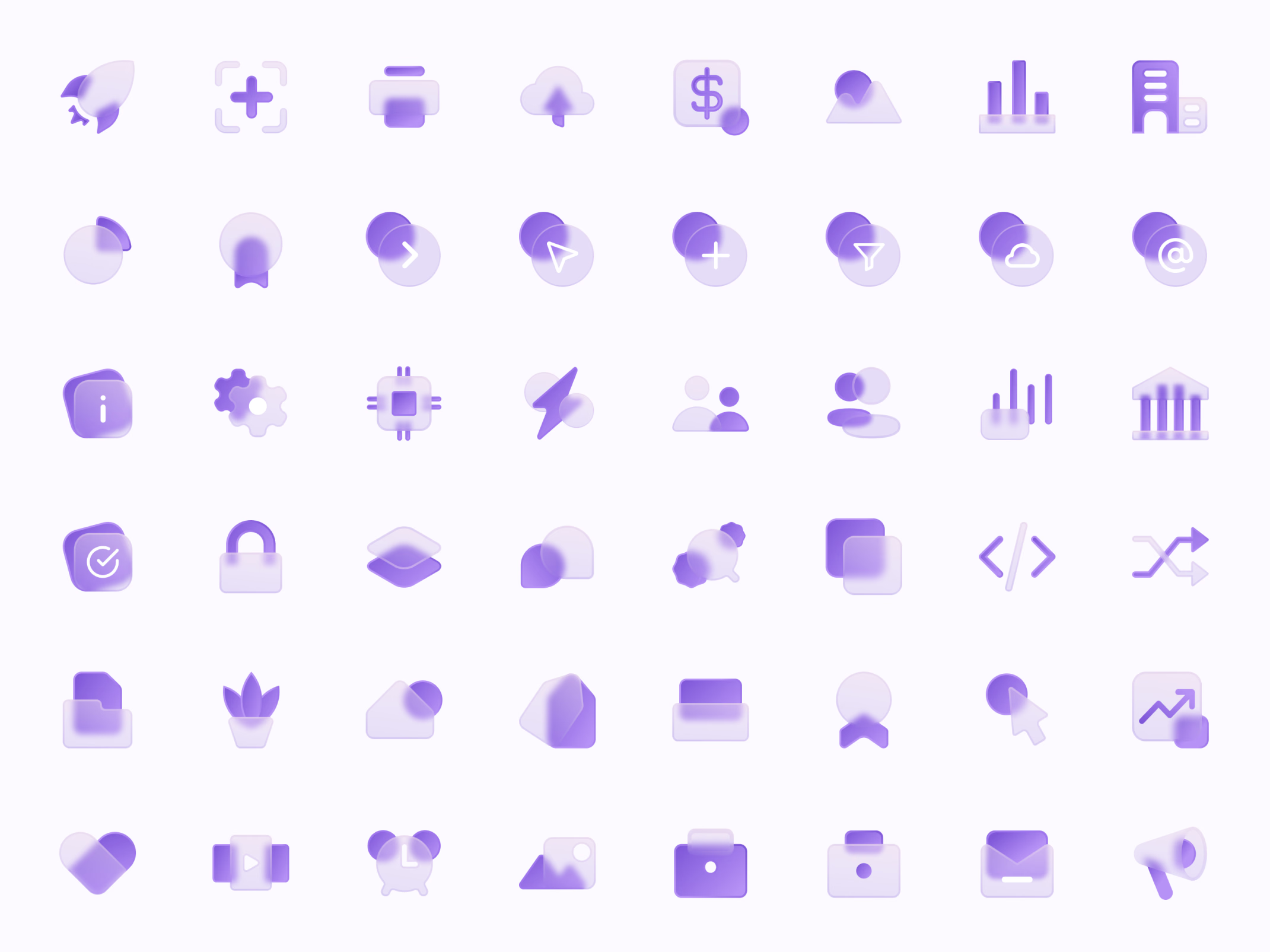
The second version of Lantern’s glass icons, now on a light background.
Forty-eight icons follow one recipe: a solid purple shape layered behind or in front of a frosted, see-through one. The set covers the product’s vocabulary, from companies, people and visitors to filters, integrations, code, security, reports, campaigns and job changes.
In light purple tones, the icons work on white, the color of the app itself, instead of needing a dark backdrop.
Got something real to build?
I join your team as a design partner and stay for the long run, from the first flow to shipped UI.