Icon exploration claymorphism — Clay icon exploration for Public Grid partner onboarding
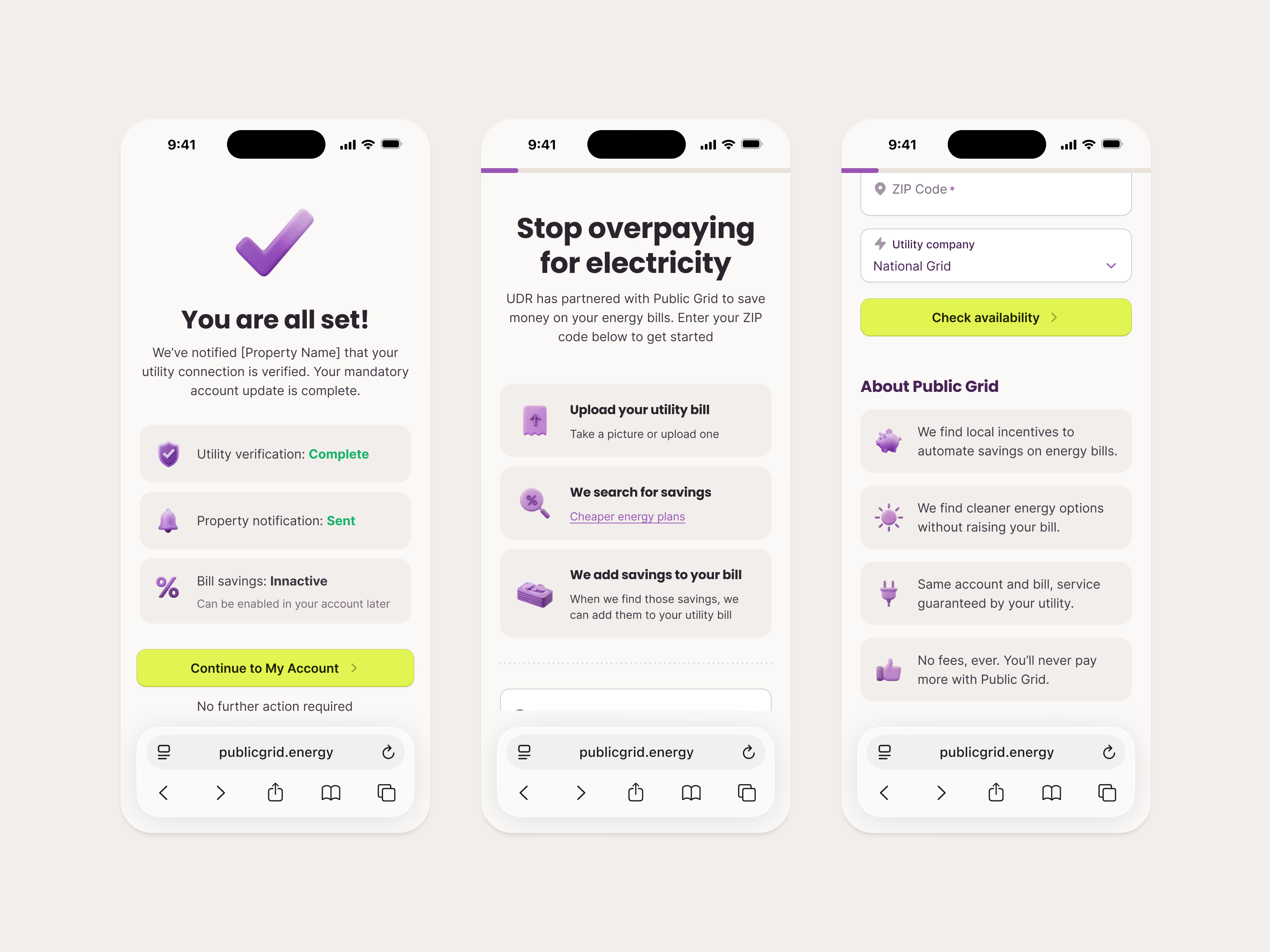
Clay-style icons tried out in context, on three mobile screens from Public Grid’s partner onboarding.
The landing screen says UDR has partnered with Public Grid to cut energy bills and explains the process in three cards: upload your utility bill, Public Grid searches for savings, savings are added to your bill. Further down, About Public Grid lists four promises next to icons. The final screen confirms the resident is all set, with status rows for utility verification, the property notification and bill savings.
Each icon gets a soft gray tile so the purple clay reads clearly at small sizes.
Got something real to build?
I join your team as a design partner and stay for the long run, from the first flow to shipped UI.