Passport application flow for HelloGov — Passport application checkout flow for HelloGov
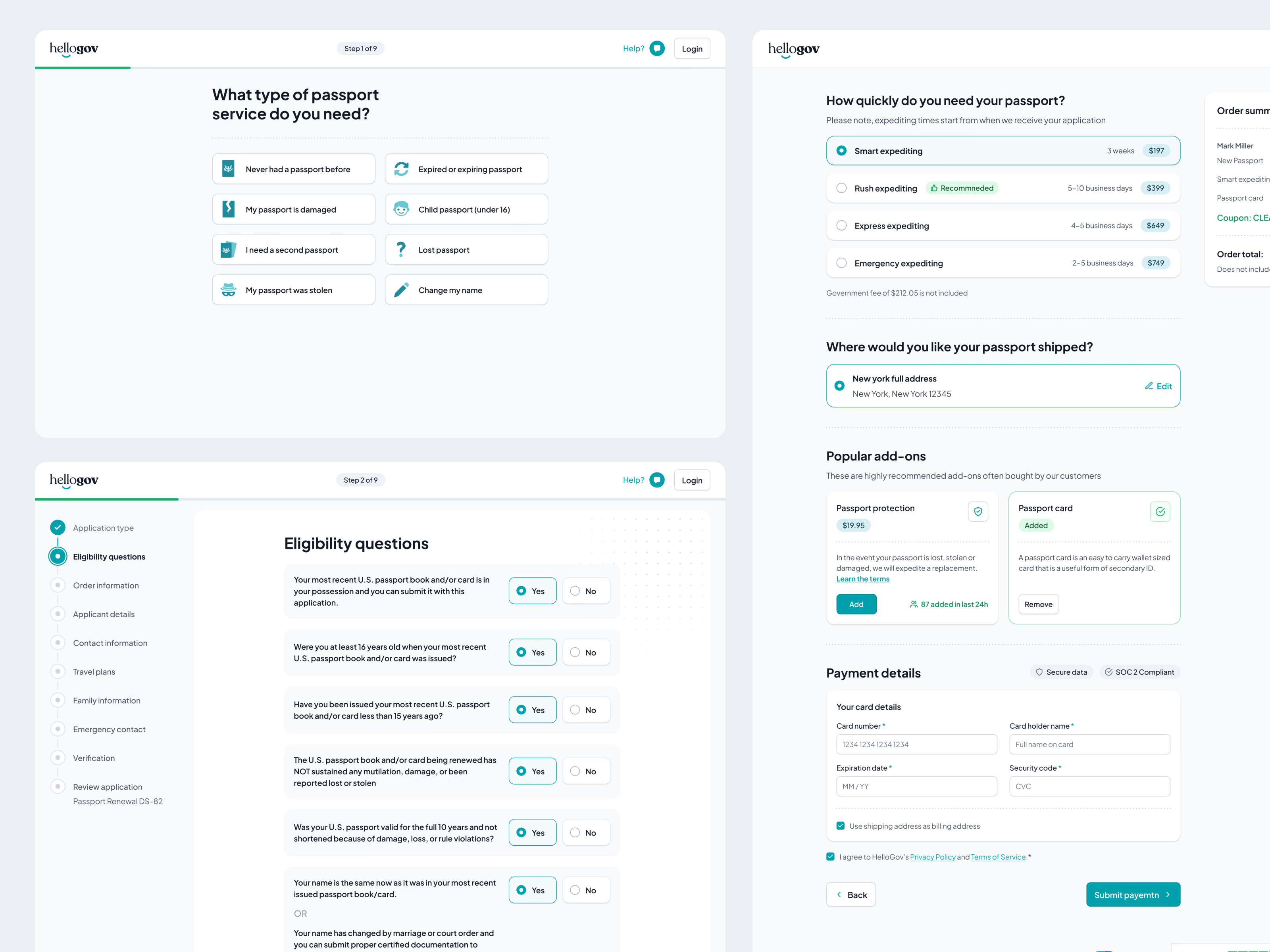
HelloGov’s passport renewal flow, redesigned end to end: from choosing the service, through eligibility screening, to order details and payment. Nine steps in all, so the main job was making each one feel short and low-effort, even with a lot of government paperwork behind it.
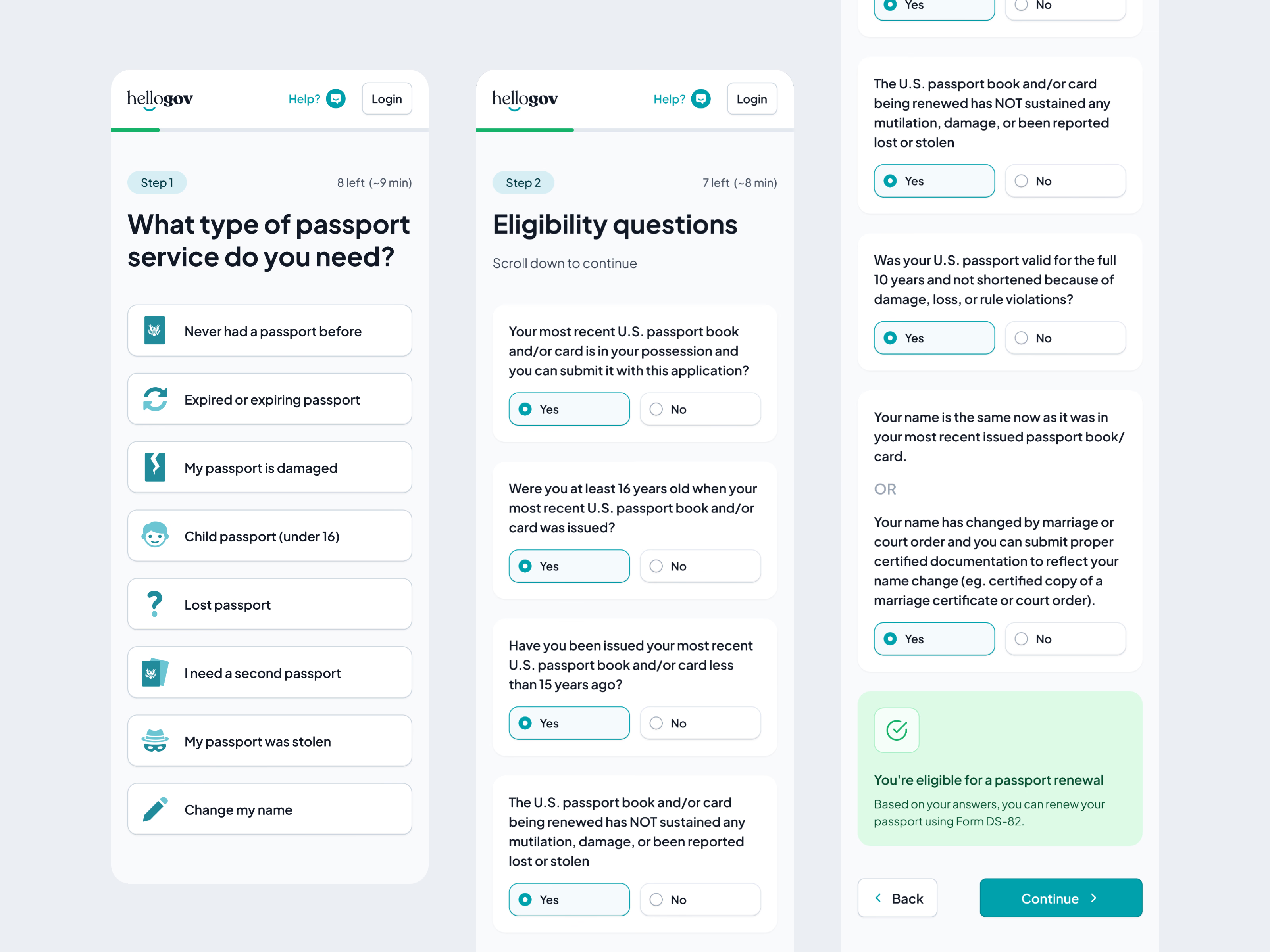
One detail paid off early: the icons on step 1. An A/B test of icons against plain text lifted conversion on that step by 23% from day one, small visual cues doing heavy lifting when people scan fast. The eligibility step could have felt like an interrogation, so every question starts on Yes: people scan and confirm instead of tapping through each one. The moment they qualify, a green confirmation names the form they need, DS-82 for a renewal.
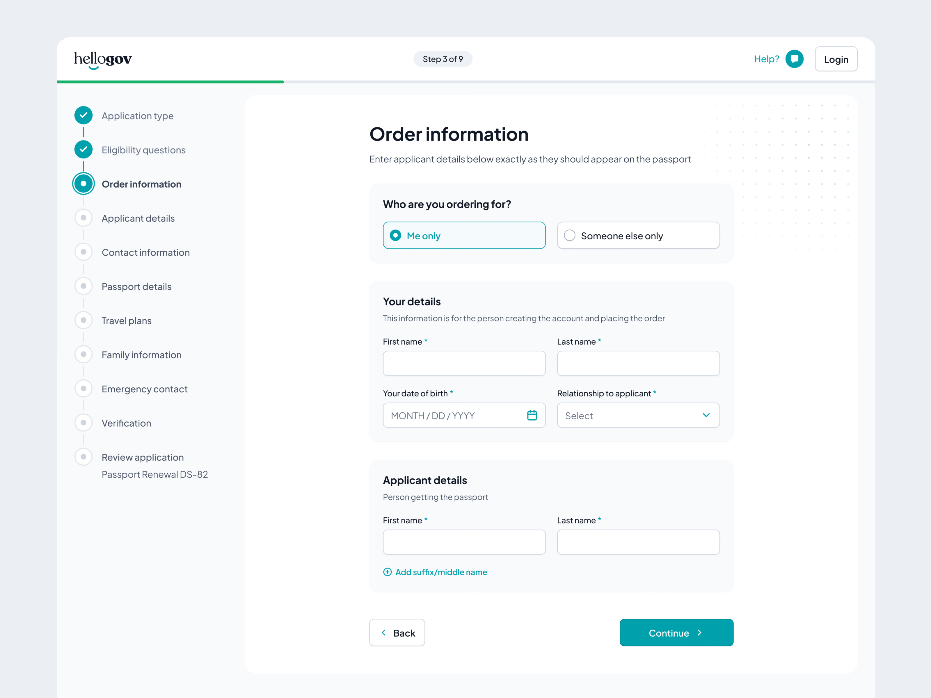
Order information comes next, with the full list of steps beside it: who you’re ordering for, your details, then the applicant’s name exactly as it should appear on the passport. The last screen gathers delivery: expediting speeds with time frames and prices, the shipping address, popular add-ons and the card form, with an order summary alongside.
Got something real to build?
I join your team as a design partner and stay for the long run, from the first flow to shipped UI.