Post-pay checkout flow for HelloGov — Post-pay passport checkout flow for HelloGov
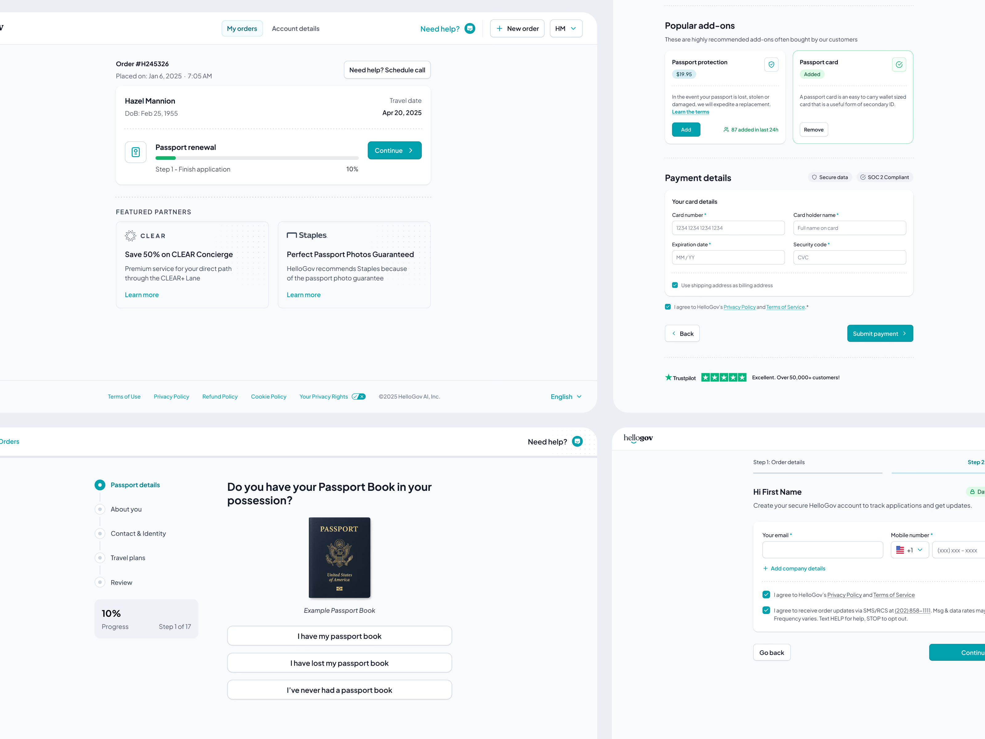
HelloGov’s checkout, flipped from prepay to post-pay. Instead of asking for a card before people have even started, they go through the whole application first and pay only once everything is submitted and reviewed. The old flow put a payment wall at the front door: people hadn’t built any commitment yet, saw a price, second-guessed it and left.
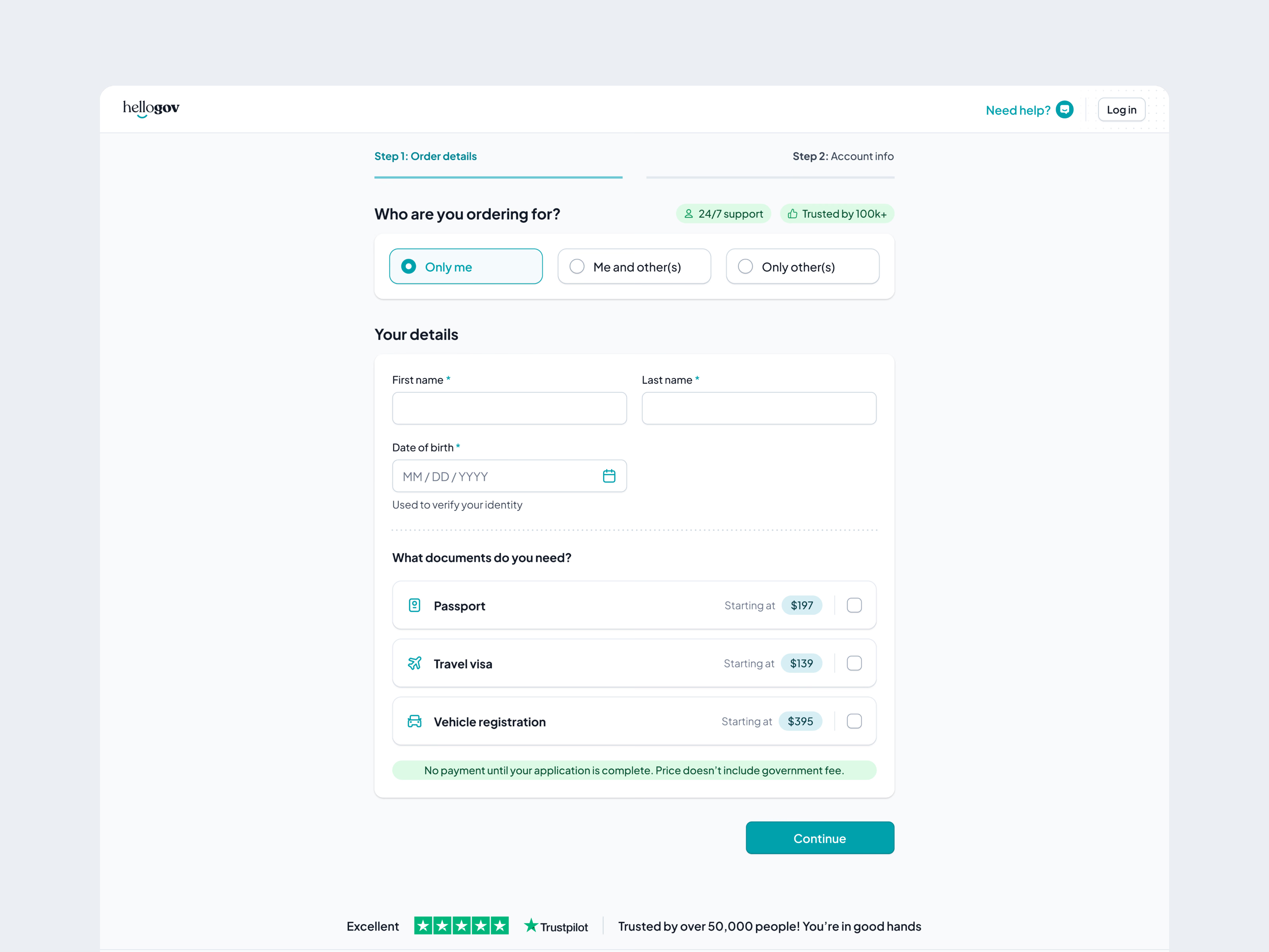
Step 1 is stripped back to the essentials: who you’re ordering for, your name and date of birth, and which documents you need, each with its starting price so there are no surprises later. A green line says it plainly: no payment until your application is complete. No account creation, no card details, nothing that makes someone pause and reconsider.
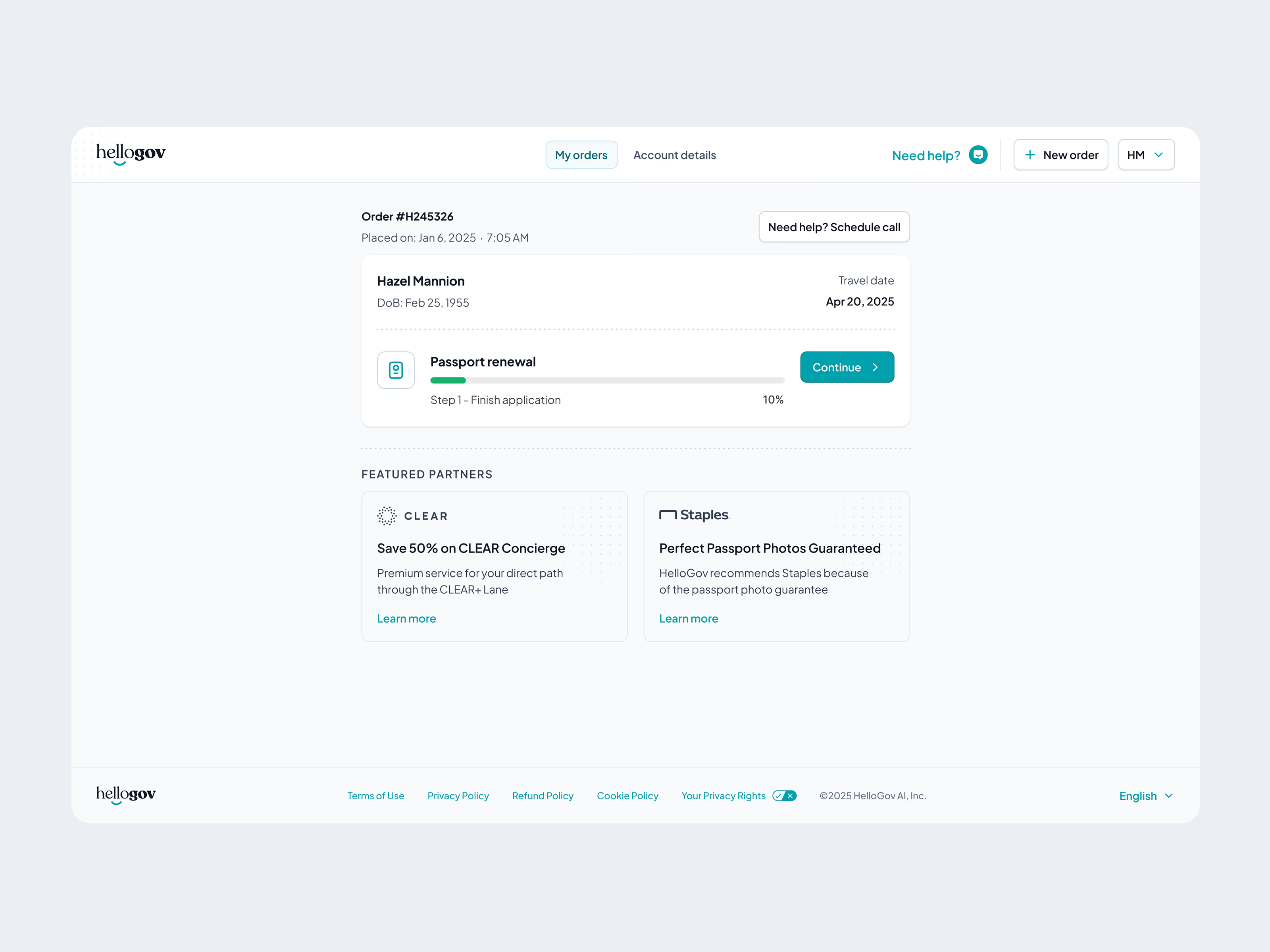
The order dashboard matters more in this model, because people come back over several sessions to finish. One card per order, a progress bar and a big Continue button make it obvious where they left off, with featured partners, CLEAR and Staples, underneath.
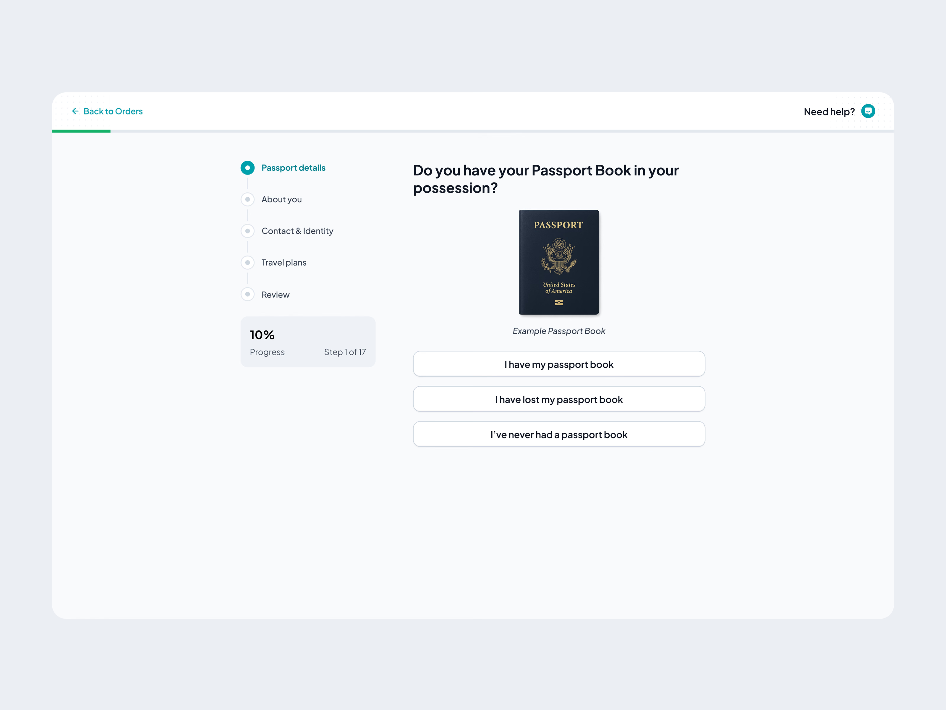
Then come the 17-step application, the add-ons at the moment they’re relevant (passport protection and a passport card, after someone has committed but before they pay), and payment at the very end. By then people have invested 15 minutes and can see exactly what they’re getting.
Got something real to build?
I join your team as a design partner and stay for the long run, from the first flow to shipped UI.