Renewable energy impact dashboard for Public Grid
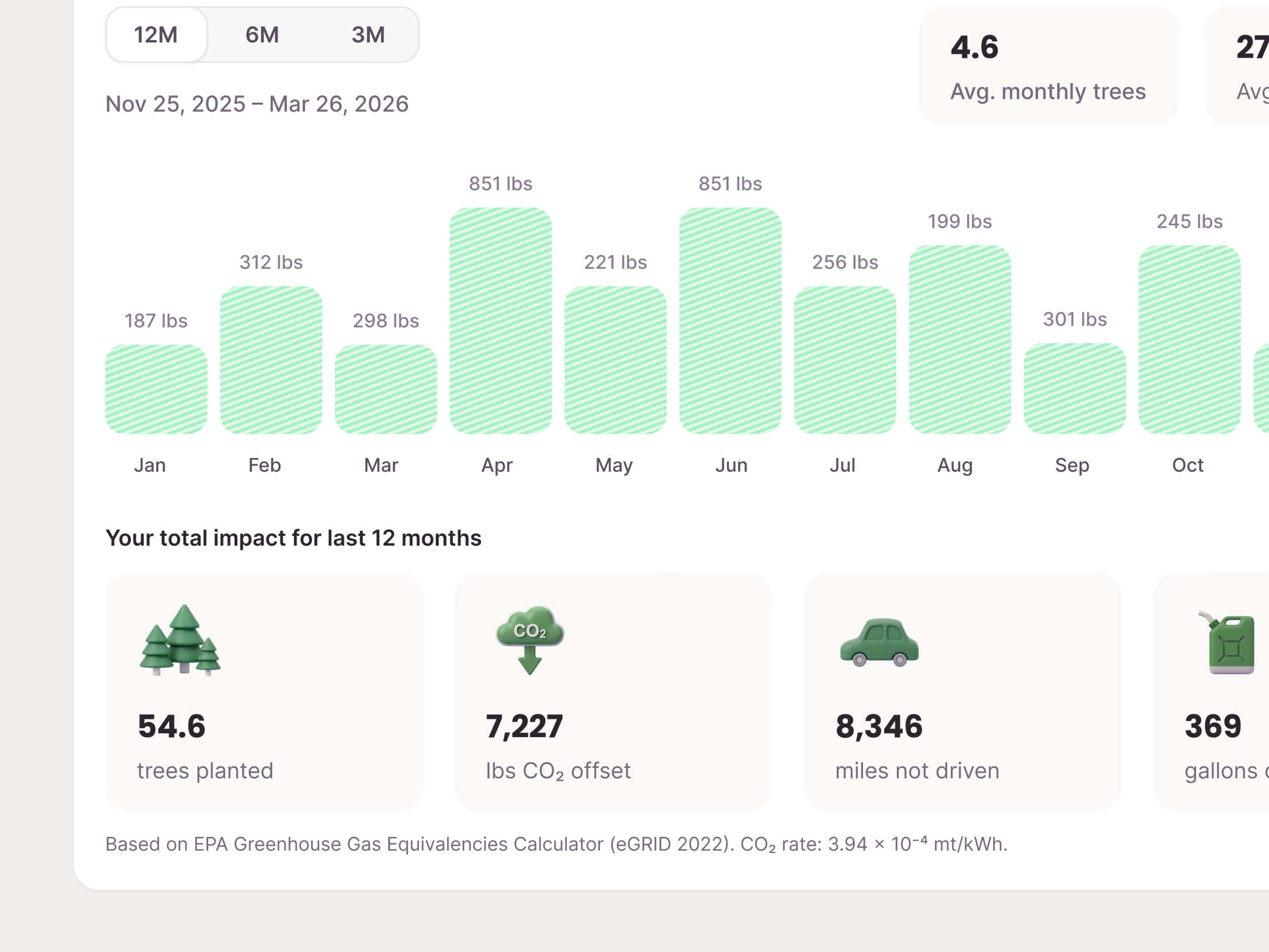
The Renewable tab in Public Grid’s insights dashboard, showing customers on 100% renewable energy exactly what their subscription is doing. A chart shows the CO₂ each month’s clean energy offset, with 12, 6 and 3 month toggles to zoom in on trends.
Below it, the year’s total turns into things people can picture: trees planted, pounds of CO₂ offset, miles not driven, gallons of gas saved. Nobody knows what 7,227 lbs of CO₂ looks like, but 8,346 miles not driven clicks at once, and that reframing makes the subscription feel tangible rather than a line on a bill. The numbers follow the EPA’s Greenhouse Gas Equivalencies Calculator, and the source sits right under the cards, so the claims hold up when someone checks.
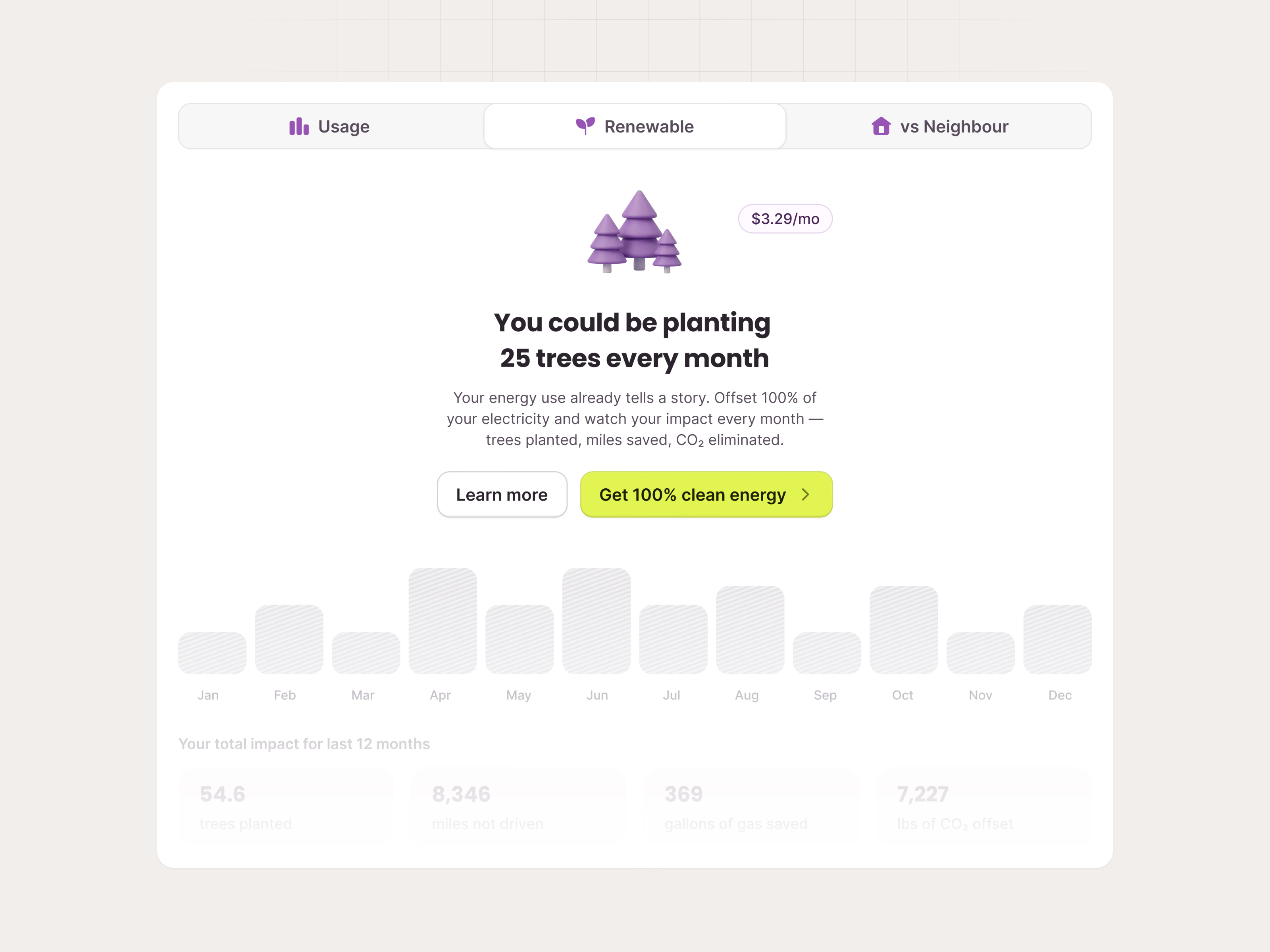
Customers without the plan see the same tab as an empty state: a faded chart behind You could be planting 25 trees every month, the $3.29 monthly price, Learn more and Get 100% clean energy.
Got something real to build?
I join your team as a design partner and stay for the long run, from the first flow to shipped UI.