Stacked Bar Chart study in Crobox brand colors
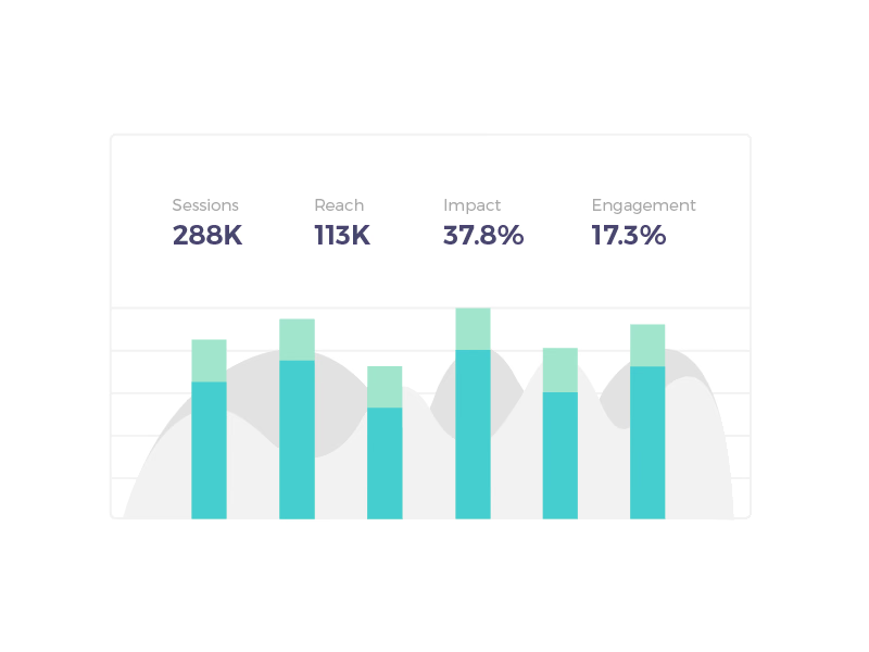
A chart study in Crobox’s brand colors, one of several graphs tested for its website and dashboards.
Four headline numbers sit across the top, sessions, reach, impact and engagement, with stacked bars in teal and mint underneath. Soft gray area shapes run behind the bars, adding a second layer of data without competing with them. Thin gridlines and a light frame keep it quiet, and the figures are example data.
Got something real to build?
I join your team as a design partner and stay for the long run, from the first flow to shipped UI.