Tabs Exploration — Hiring pipeline stage tabs exploration for a job page
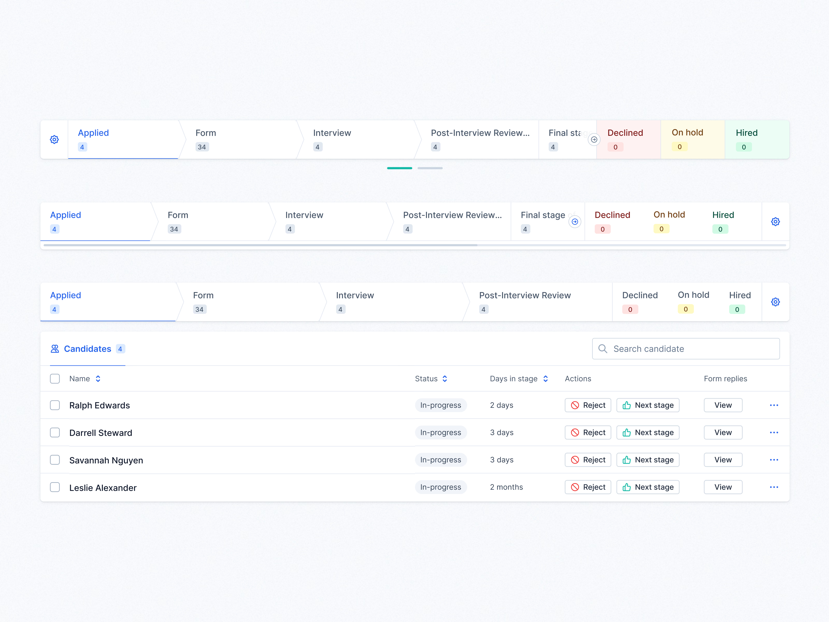
An exploration of the pipeline tabs on a hiring tool’s job page, the row that shows every stage and how many candidates are in it.
Each stage is an arrow-shaped tab with its count, and the final states (Declined, On hold, Hired) get their own colors. The versions differ mainly in how they handle more stages than fit: the first pages through them with dots under the row, the second adds a scrollbar, and the third fits every stage and shows the candidate table underneath, with Reject, Next stage and View form replies on each row.
Got something real to build?
I join your team as a design partner and stay for the long run, from the first flow to shipped UI.