Todo list exploration — Task list layout exploration for Lantern spotlights
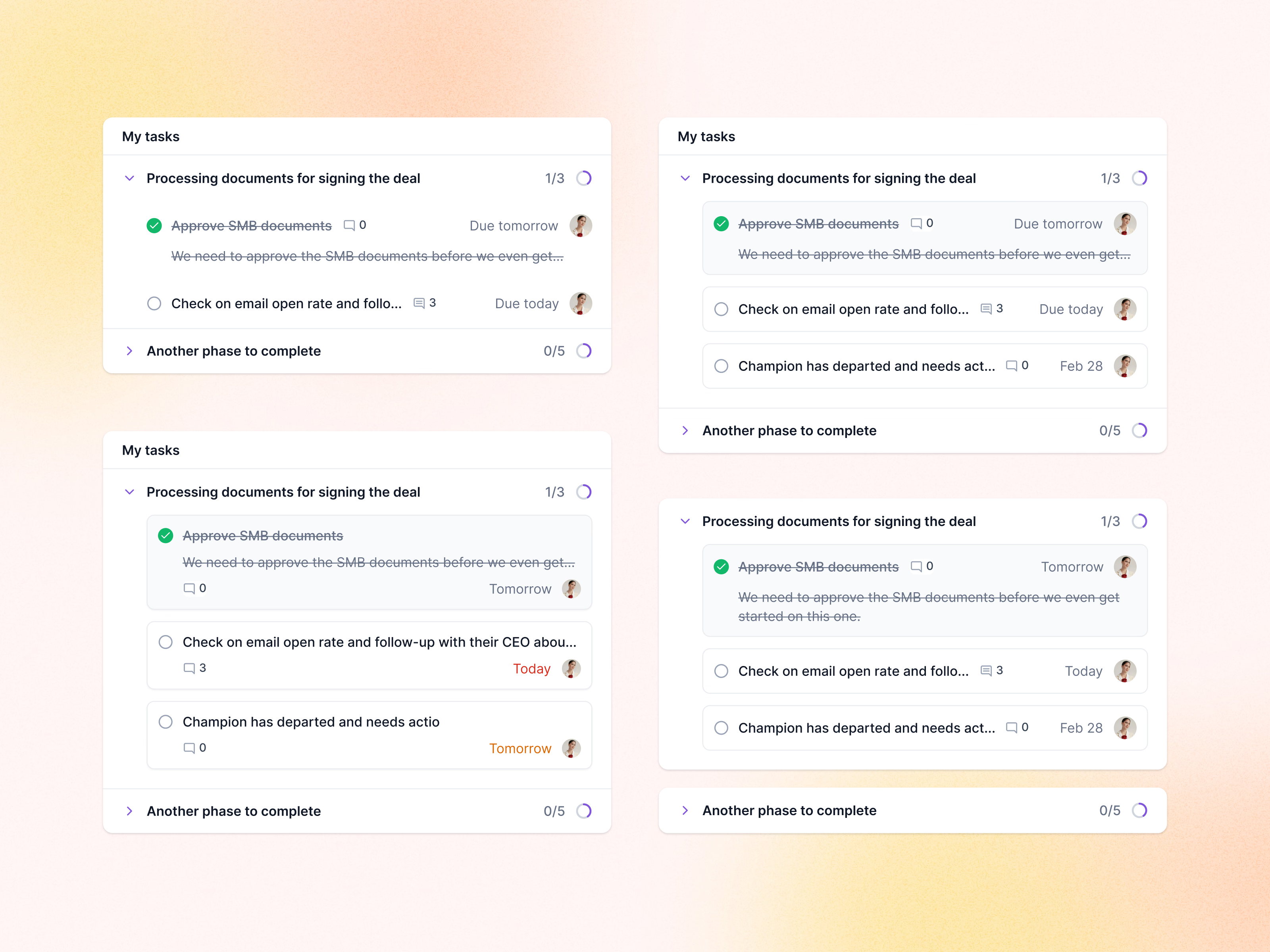
An exploration of the task list in Lantern’s spotlights: the same phase, Processing documents for signing the deal, drawn four ways.
The versions test density and grouping. One keeps tasks as flat rows, the others give each task its own card; one moves the comment count under the title, another lets a completed task’s note run to two lines. Due dates stay gray in most and turn red or orange by urgency in one. Each phase header keeps a count and a small progress ring, with the next phase collapsed below.
Got something real to build?
I join your team as a design partner and stay for the long run, from the first flow to shipped UI.