Workforce cost dashboard (finance) — Workforce cost and budget dashboard for a finance app
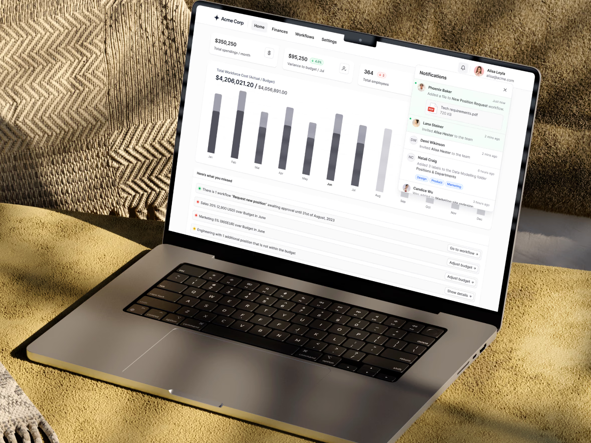
The home dashboard of a workforce finance app, shown on a laptop with a placeholder brand.
Three figures sit at the top: total spending per month, variance to budget and total employees. Below them, a bar chart compares total workforce cost with the budget month by month.
A Here’s what you missed list turns the data into to-dos, such as a position request awaiting approval or a department running over budget, each with a direct action like Go to workflow or Adjust budget. Notifications open in a panel on the right, showing who added files, invited teammates or labeled folders.
Got something real to build?
I join your team as a design partner and stay for the long run, from the first flow to shipped UI.