Purple or Green? Explorations in Impact Tracking — Energy savings impact card explorations for Public Grid
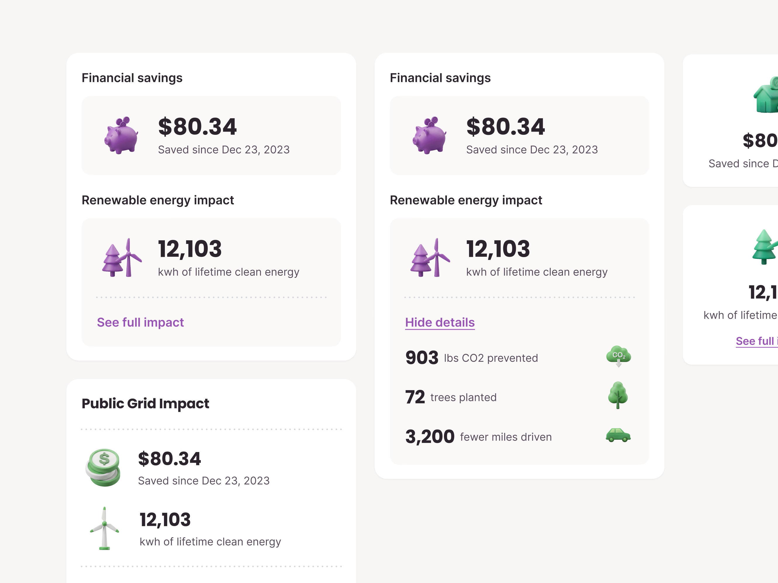
Two directions for the savings and impact cards in Public Grid’s app: purple 3D icons on one side, green on the other.
Each card leads with money, how much the customer has saved since joining, then renewable energy impact in lifetime kWh. See full impact expands the card in place to show CO₂ prevented, trees planted and fewer miles driven, each with its own small icon, and Hide details folds it back. The numbers are example data.
A third, more compact Public Grid Impact card stacks both figures in a single list.
Got something real to build?
I join your team as a design partner and stay for the long run, from the first flow to shipped UI.