You Don't Need to Be a Genius to Build an Accessible UI
A lot of teams now ship without a designer, and dark UIs show it first. How I reworked a car marketplace's filters with Claude, the prompts I used, and what you still have to test yourself.
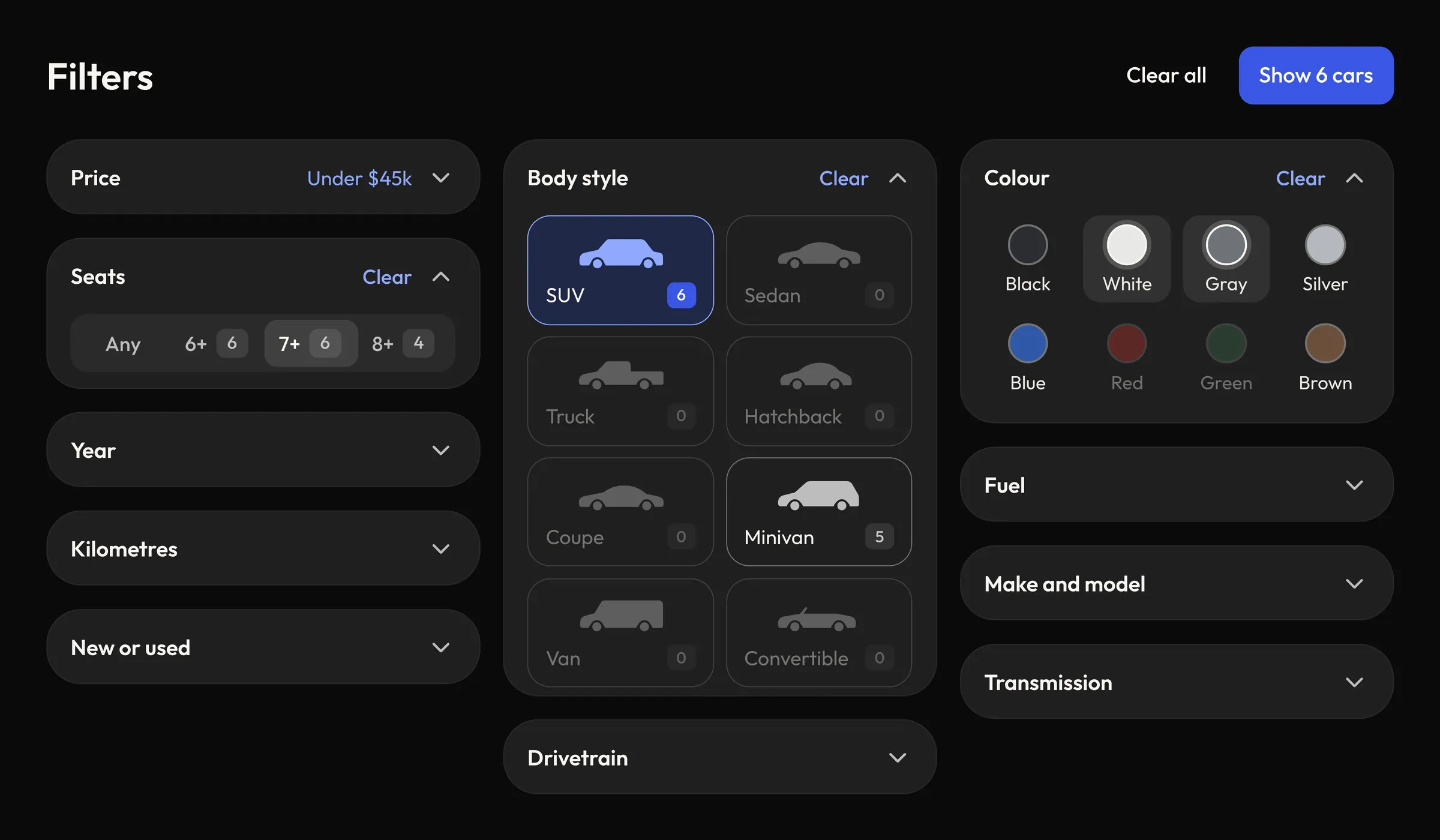
I’ve been doing this for almost 12 years, so the moment I log in to a product, I notice things. Is this clickable? What should I do next? Maybe it looks good on the iMac it was built on, but people also use Windows laptops, phones and tablets. Can they even read it?
A lot of developers now build without designers. They use their own style, it looks fine in their dark theme, and it ships. Accessibility is usually the first thing to go, because the person who built it can’t see the problem.
Here’s the thing: it’s not hard anymore. You don’t need to be a freaking genius. You can just do it.
To show you, I’ll use a product for researching and buying cars. I went through their live product, rebuilt the filters with Claude and sent them the proposal. I don’t know how their team works, and this isn’t a dig at them, so I’m leaving the name out. Their filters are just the example I know best. Every number below comes from their live site and my rework, tested on November 4, 2026.
The code isn’t the problem
I expected the code to be the issue. It isn’t. Their price slider has labels, the arrow keys move it, a focus ring shows up, and Enter and Escape work on the controls around it. Whoever built this chose solid components.
The problem is everything on top.
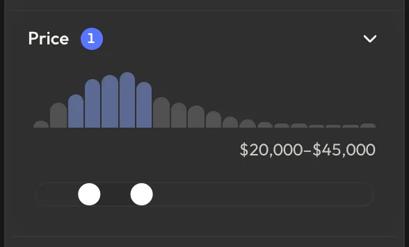
Live product
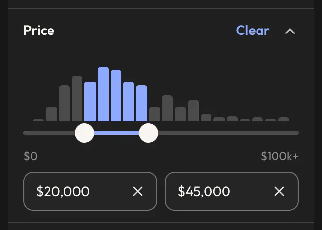
My rework
- The track is almost invisible. The selected range is 1.04:1 against the panel, and the track’s edge is 1.12:1. What you really see is two white dots.
- The label is too quiet. Before you touch the slider, it says “Any” at 12 pixels and 3.93:1. Small text needs 4.5:1.
- The bars look clickable, but they aren’t. Clicking one does nothing, and hovering shows nothing. Clicking the track does work, if you can find the track.
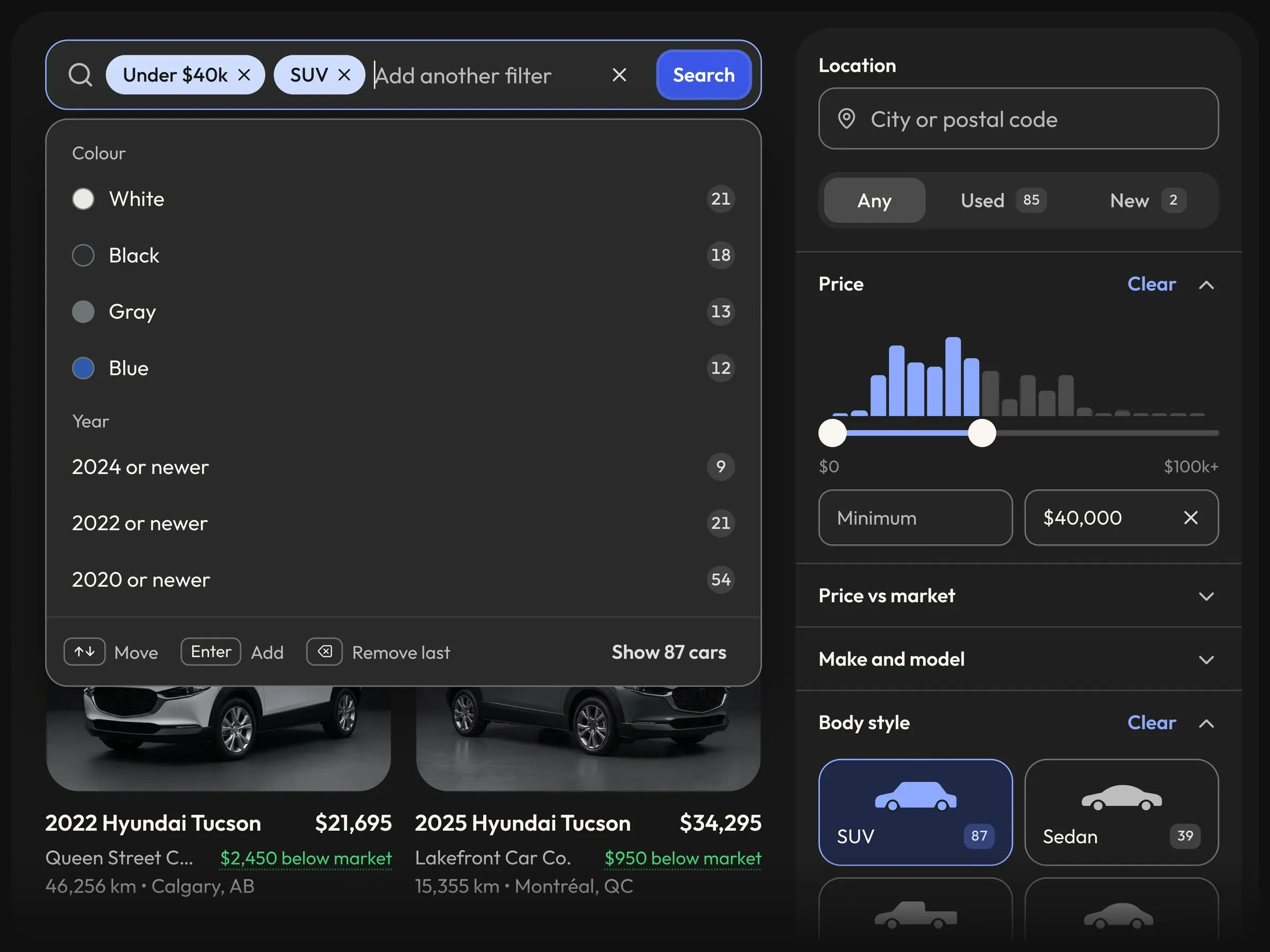
In my version, the selected bars and range are 7.35:1. Hover a bar and you see its price. Click it and the closest handle moves there. Or just type the price. For a screen reader, the handle exposes “$22,500” instead of a bare number.
The prompt wasn’t clever. This is what I actually typed:
I want you to allow hovering on this bar here and also show a small, compact tooltip with the price. If I click on it, it moves to that one, so I can grab it and move it, or just click on different things and it moves. The closest one, either the left one or the right one, moves there.
This is what came out of it:
Dark UIs fail first
On a dark UI, all your grays sit close together. A border two shades lighter than the panel looks deliberate on a good screen. On a cheap laptop, it’s gone. Here’s what I’d check first.
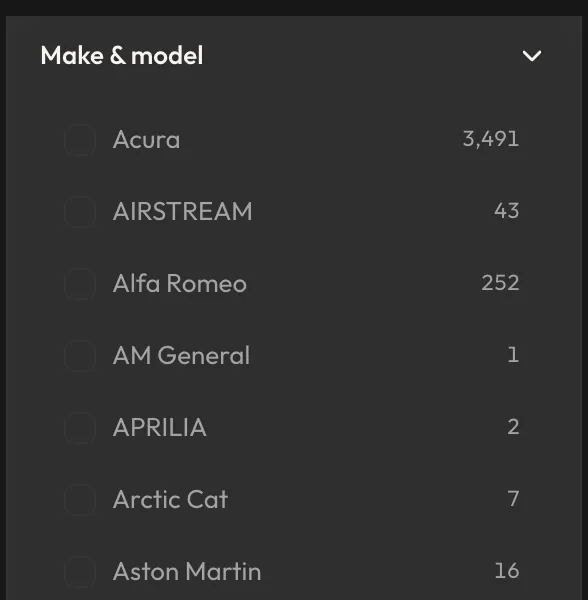
Anything you can click needs 3:1. Their unticked checkboxes are 1.12:1 against the panel, so you can barely find them. Mine use a gray that reaches 3.48:1.
Live product
My rework
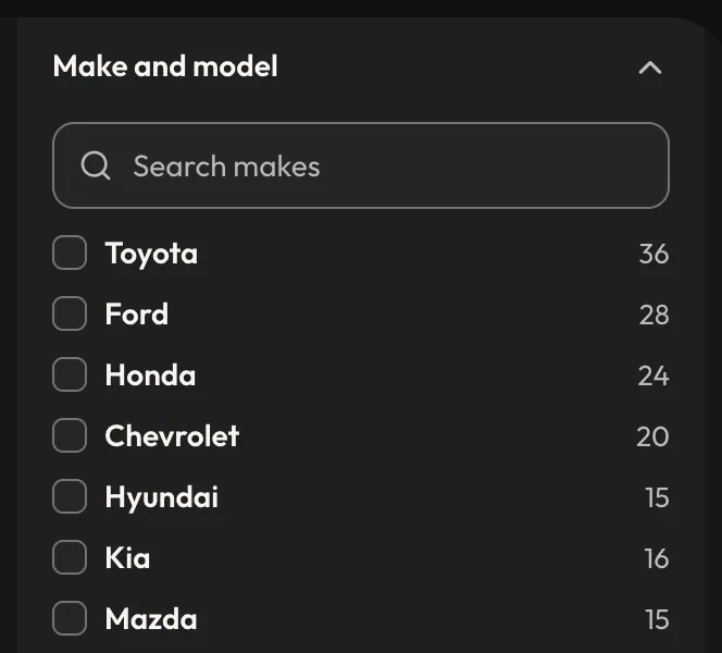
Don’t make one accent do everything. Their Sign up button puts pale text on light blue, at 2.06:1. In my theme, the button blue carries its label at 5.23:1, but as text on the dark panel it drops to 2.9:1. So buttons get that blue, and text gets a lighter one at 7.35:1.
Put the rule in the token, not the screen. This is where a design system earns its keep. The contrast decision lives in the theme, so the next filter someone adds starts out right:
// 300 is the edge of every field and control:
// 3:1 against the page and the cards.
300: '#737373',

// The button blue is too dark to read as text
// or an icon on this page, so text takes lighter stops.
const readableBlue = { 400: '#8FAAFF' /* ... */ };
Don’t flip a light theme and call it done. I re-themed a library made for a light UI by flipping its gray scale. Tooltip text vanished because the old dark gray had become pale. A checkbox kept its hard-coded white box. The phone field kept its light borders. After a flip, test every component, not just the page you’re looking at.
Let people zoom. Their viewport tag includes maximum-scale=1, user-scalable=no, which asks phones to block pinch zoom. If you need bigger text, that’s a problem. Delete it. It’s one line.
No dead ends
My main philosophy has always been: do not make me think. Don’t make people work out what’s clickable or what to do next. You get there by designing for all the states, and the one everybody forgets is the one where nothing comes back.
Live product
My rework
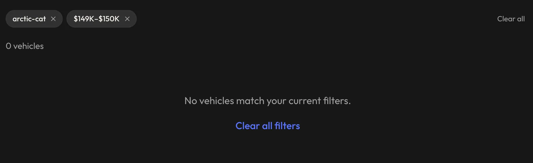
On the live product, you can still remove one chip at the top, but the only action on offer wipes everything you set up.
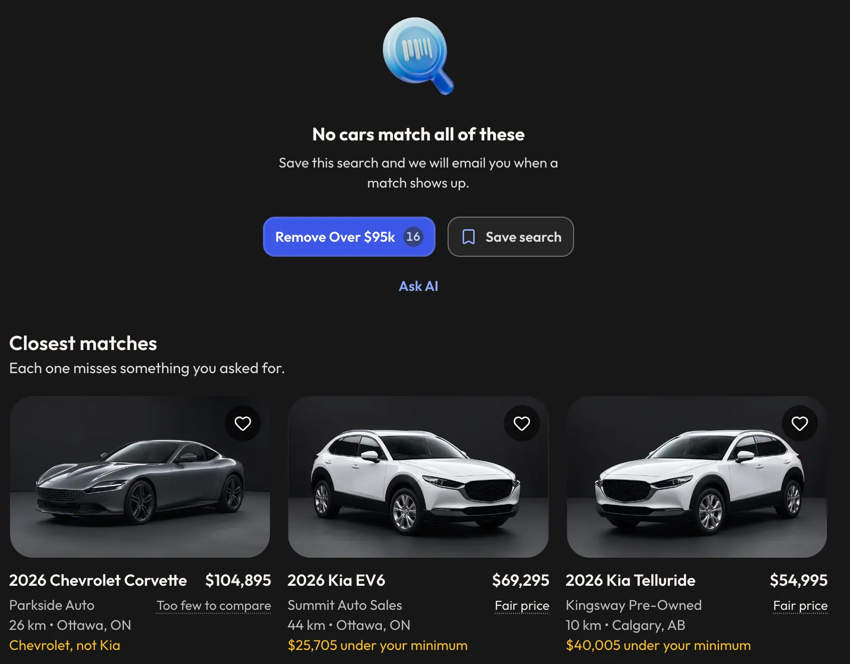
Mine leads with the one change that brings back the most useful number of cars: Remove Over $95k, 16 cars. You can save the search and get an email when a match shows up, or ask the AI about it. Underneath are the closest cars and what each one misses: “Chevrolet, not Kia”, “$25,705 under your minimum”.
The prompt was one line:
we need to design for some empty states where there is no results but make them actionable
The same pass covered the other dead ends. A search it can’t read says so, and a typo gets “Did you mean”. It depends on the use case, of course, but a dead end should lead to something else.
What I’d paste into Claude
If you don’t have a designer, start every project with this. The principle comes from Steve Krug’s book, and it’s worth reading.
Always follow the principle of “Don't Make Me Think” on what's clickable and what I should do next. Keep it human, warm and straight to the point. Follow the accessibility and WCAG rules.
Claude basically knows the rest. For something you’ve already built, follow it with an audit:
Audit this screen. Measure the rendered contrast against the real backgrounds: 4.5:1 for small text, 3:1 for controls and their edges. Check every state: hover, press, focus, disabled, loading, empty and error. Check the keyboard: Tab, Enter, Escape and the arrow keys. Check it on a phone. Tell me what fails, with the numbers. Then fix it in the tokens and shared components, not screen by screen.
And one rule of mine that’s worth stealing:
What is clickable gets a hover and a press. What is not gets neither.
Then go click around
AI will still fall short on many things. That’s where you come in. You have to know what to tweak, and you only find out by using it.
My first rework still needed a contrast pass. The hover on tertiary buttons was barely visible. On phones, hidden menus and filter rows were catching taps and keyboard focus. You don’t spot that by reading a diff. So after every round, I do the same thing:
- Check the contrast.
- Test it on different screen sizes, then specifically on mobile.
- Open it and click around. Does it work?
- Put the mouse down. Does it work with the keyboard? Does it work on Escape? What happens when I press Enter? Can I move with the arrow keys?
That’s how you end up with a search like this one, where the keyboard can do everything the mouse can. If you want more, I wrote about what living in Claude is really like.
A clean scan doesn’t mean you’re done
Then run a scanner. I ran axe, a free accessibility checker, on both:
| Check | Live product | My rework |
|---|---|---|
| axe failures, filter page | 117 elements across 4 rules | 0 |
| axe failures, phone | 1: pinch zoom blocked | 0 |
| axe failures, open search list | No search list on this page | 1: a button inside a listbox |
| Selected price range | 1.04:1 | 7.35:1 |
| Unselected track | 1.12:1 (its edge) | 1.86:1 |
| Unticked checkbox edge | 1.12:1 | 3.48:1 |
| Slider value exposed | 21000 | $22,500 |
| Click a histogram bar | Nothing | Closest handle moves |
| Type an exact price | No | Yes |
| Tab presses to reach price | 228 | 149 |
Their biggest number is 114 filter rows that nest one interactive control inside another. The others are a dropdown with no accessible name, the Sign up button and the blocked zoom.
Now look at my column. The filter page scanned clean, and it still isn’t right:
- My unselected track is 1.86:1. That’s below the 3:1 I just held their checkboxes to. Axe checks text contrast, not controls, which is also why it never flagged their 1.04:1 range.
- It takes 149 Tab presses to reach my price filter, because every listing card comes first. Better than 228. Still awful.
- My open search list has a real failure: a button inside a listbox. Axe was right about that one.
None of this is hard. The track can use the same gray as my field edges, which is 3.48:1. A skip link deals with the tabs. A few more prompts. And neither a scan nor a keyboard pass tells you how it sounds, so turn on VoiceOver or NVDA and listen.
You never get it right from the first shot.
Start with these five
- Remove
user-scalable=noif it’s in your viewport tag. - Put the three rules above in your project’s instructions.
- Run the audit prompt on the component your users touch the most.
- Put your mouse away for five minutes and try to use your own product.
- Find your worst dead end and ask Claude to make it actionable.
So do you still need a designer?
Not all the time. What a good designer does is set up the foundation. A checkbox isn’t something you have to keep changing. You design it once, with its states, and it’s done. Then components scale, components morph, filters appear, multiple filters appear, and you reuse everything.
That’s why this rework was fast. I didn’t start from zero. I started from the design system I built for TimiTomi, the booking software I’m building for studios, and themed it for their dark UI. Thirty of the 34 commits on its main branch landed in one day. Claude could move that fast because the buttons, inputs, tabs and empty states already existed.
You can take it a long way without a designer. You can get good enough for many, and for many, good enough is good. Keep it that way. That’s not a big issue. But at one point, you keep adding, you keep improving, and you need somebody in the loop with everything.
A design system is never a one-stop shop.
It goes out into the wild, and you have to make changes to it. Things adapt, things break, new error states appear. You keep polishing it for the next use case.
So no, you don’t need a genius. You need someone who keeps opening the product and pressing Tab.