How to Design Forms People Actually Finish
Ask first and charge last, group the quick questions, and give every screen the right Continue. Seven lessons from a passport application and a psychiatry sign-up, each with the before and after.
It’s 2026, and people still hate filling in forms. The people who make them still get the same things wrong: they ask you to pay before the first question, turn one tap into six, and hide Continue under the keyboard.
Here’s what I learned from two of them: HelloGov, a 17-step passport application I worked on for a year, and a concept I made for Legion Health’s psychiatry sign-up. GOV.UK’s guide to structuring forms is still the best rulebook I know, so I’ll show where I followed it and where I broke it on purpose.
1. Ask first, pay last
HelloGov used to work like a shop. You picked a service and a delivery speed, created an account, added shipping, paid, and only then started the 17-step application.
We turned it around. Now you give a few details, fill in the application, see the add-ons when they matter, and pay at the very end.
Before
- 1 Service
- 2 Speed
- 3 Account
- 4 Shipping
- 5 Payment
- 6 Application, 17 steps
pay first, questions later
After
- 1 Order details
- 2 Account
- 3 Application, 17 steps
- 4 Add-ons
- 5 Payment
Rollout
Google Ads traffic sent to the new order
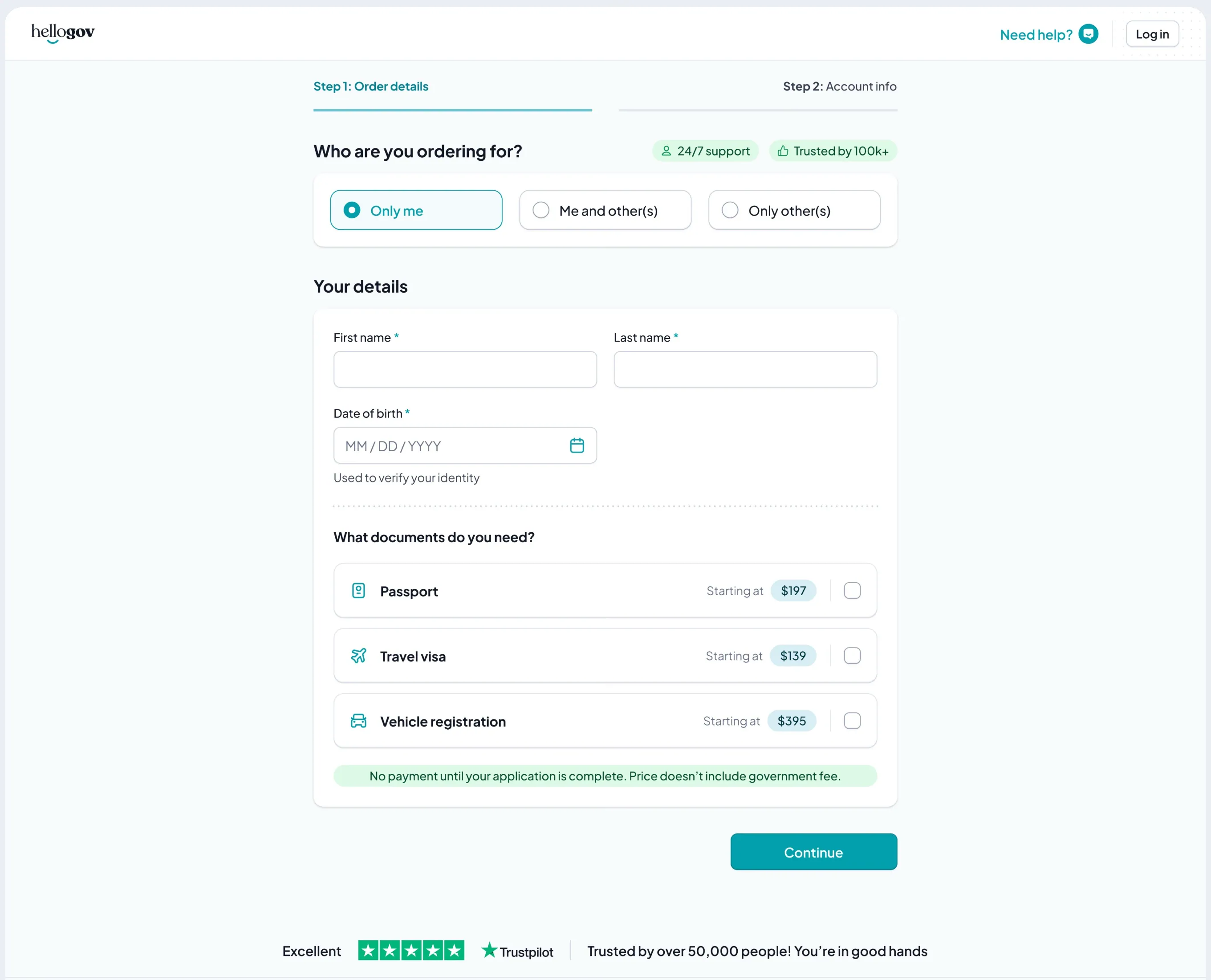
The first step now asks who the order is for, your name, your date of birth and which documents you need. A green line under it says it plainly: no payment until your application is complete.
To a lot of people that sounds obvious. Of course you pay at the end. But when millions of dollars of revenue come in through one checkout, “obvious” doesn’t convince anyone, and it shouldn’t. So we didn’t argue. We built a prototype of the new order and sent 20 to 30% of the Google Ads traffic to it. It beat the control, so it went to 50%, then to 100%.
By the time people pay now, they’ve put in about 15 minutes and can see exactly what they’re getting.
Do this: Put payment at the end. If someone pushes back, don’t debate it. Test it on a slice of real traffic.
2. Open with the question that rules people out
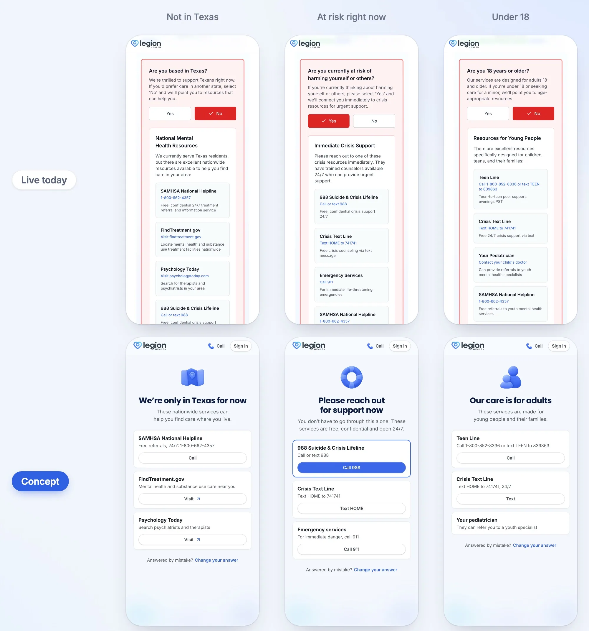
GOV.UK says to start with the questions that tell people they’re not eligible, so you don’t waste their time. Legion does ask that first: are you based in Texas? But on a phone, a patient quote and a paragraph about being the right fit come first, and the question starts near the bottom of the screen.
In the concept, the question comes first, with Yes and No right under it. The quote, signed “Legion Health Patient”, becomes Legion’s Google rating and a named Google review. That’s the kind of proof people look for before they share anything about their mental health.
Then design the No. On the live flow, a No turns red and a box of resources opens inside the question card. In the concept it gets a page of its own: what the answer means in one line, the services that can help, each with its own button, and Change your answer for a tap made by mistake.
Live today
Let’s make sure we’re the right fit
Are you based in Texas?
The question starts near the bottom, under a quote and a paragraph.
Concept
Do you live in Texas?
We can only see patients in Texas for now.
4.4 on Google
Named Google review
The question comes first, with a review people can check.
Concept, after a No
We’re only in Texas for now
These services can help you find care where you live.
Answered by mistake? Change your answer
A No gets its own page: where to go instead, and a way back.
Some answers can’t wait. If someone says they’re at risk of harming themselves or others, the concept leads with 988 as the only filled button on the page, ahead of the Crisis Text Line and 911.
Do this: Ask the rule-out questions first, and give every No a page that tells people where to go next.
3. Group the questions that are related and quick
GOV.UK says to start with one thing per page, and most of the time I agree. HelloGov’s eligibility step is where I didn’t.
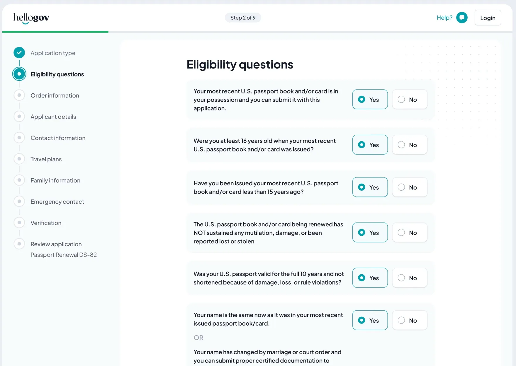
Six yes-or-no questions check whether you can renew by mail. Do you still have your last passport? Were you at least 16 when it was issued? Was it issued less than 15 years ago? They’re all about the same thing, and most people are eligible. So they sit on one page, already set to Yes. Most people read them and tap Continue. If one doesn’t apply, you tap No, and the flow takes you somewhere else.
Six screens
6 taps and 6 screens to load
One page, empty
Can you renew by mail?
7 taps
One page, set to Yes
Can you renew by mail?
1 tap
most people just tap Continue
Leave them empty and everyone taps Yes six times before they can move on. Split them over six screens and the form gets six screens longer. Either way, the whole thing slows down.
My rule of thumb: if questions are related and quick, they can share a page. If something is big and needs attention, it gets its own step. Your passport details and your birth certificate details are both about documents, but each one sends you off to find a document and copy from it. Those are two steps, not one.
A pre-selected answer is a trade-off, though. GOV.UK’s design system says not to pre-select radios, because people miss the question or submit the wrong answer. It worked here because nearly everyone answers Yes, and HelloGov’s team reviews every application before it’s submitted. If a wrong answer would slip through unchecked, leave the radios empty.
Do this: Group questions by how much attention they need, not by topic. Pre-select only when almost everyone gives the same answer and a mistake gets caught later.
4. Show it, don’t describe it
HelloGov’s first step asked what kind of passport service you need, and it was a wall of text. I suggested adding icons, so each option reads at a glance. The CEO wasn’t sure it was worth it, so we ran it as its own experiment. New passport orders went up 23%.
Step 1 of 9
What type of passport service do you need?
- Never had a passport before
- Expired or expiring passport
- My passport is damaged
- Child passport (under 16)
- I need a second passport
- Lost passport
- My passport was stolen
- Change my name
People scan fast on a first step. A small picture does a lot of the work.
The same idea runs through the whole application. Lots of people don’t know a passport book from a passport card, so the question shows one. When we ask for the passport number, a sample shows exactly where to find it.
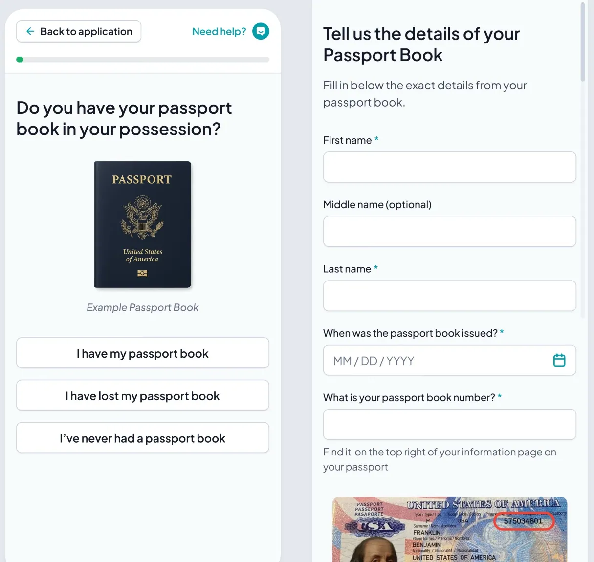
Do this: Whenever people have to recognise something, like a document, a number or a type of service, show it before they have to guess.
5. Give every screen the right Continue
David Hamill, a UX consultant, made a point about this recently that’s worth repeating. In his experience of watching people fill in forms, most don’t press Enter or Go to move on. They tap the next field or button with a finger, and scroll to find it if it’s off screen. Pin Continue to the bottom of a mobile screen and the keyboard covers it, so people tap out of the field to close the keyboard, then tap the button.
So where does Continue go? It depends on the screen:
- One yes-or-no question. Make the answers real buttons that move you on. You don’t need Continue at all.
- A list of yes-or-no questions. Use radios, and stick Continue to the bottom so nobody scrolls to find it. There’s no keyboard on this screen to cover it.
- A couple of fields. Put Continue right under the last field, and make the keyboard’s Go button submit too. People use both.
Avoid
Tell us about you
Continue is under here
Pinned to the bottom, so the keyboard covers it.
One question
Do you have your passport book?
I have it I’ve lost it I’ve never had oneand it moves on
One yes-or-no: the answers are the buttons. No Continue.
A list
Can you renew by mail?
A long list: Continue sticks to the bottom. No keyboard here to hide it.
A few fields
Your passport
A few fields: Continue right under them, and Go submits too.
HelloGov uses all three. The passport book question is three full-width answers. The eligibility list keeps Continue stuck to the bottom, because putting it after the last question meant a lot of scrolling. The details screens keep it under the fields.
Do this: Before you pin a button, open the keyboard. If the keyboard covers it, move the button.
6. Let people type dates
GOV.UK asks for a date of birth in three text boxes: day, month and year. The idea underneath is right: let people type. What I’d avoid is the version many forms still ship, with three dropdowns, or a wheel you scroll back through 35 years.
What has worked best for us is one field you type straight into on the number keyboard, with the format shown inside it. You can put a calendar next to it for people who’d rather pick, which is what HelloGov’s first step does. But typing comes first.
Pick from lists
What’s your date of birth?
- 2026
- 2025
- 2024
- 2023
- 2022
- 2021
- 2020
- 2019
- 2018
- 2017
- 2016
- 2015
- 2014
- 2013
- 2012
- 2011
- 2010
- 2009
- 2008
- 2007
- 2006
- 2005
- 2004
- 2003
- 2002
- 2001
- 2000
- 1999
- 1998
- 1997
- 1996
- 1995
- 1994
- 1993
- 1992
- 1991
- 1990
- 1989
- 1988
- 1987
35 years of scrolling
Type it
What’s your date of birth?
8 taps
When a date is missing or wrong, say what right looks like. In the Legion concept, the error reads: “Add your date of birth, like 04/12/1991.”
Do this: Let people type dates on the number keyboard. Show the format in the field, and again in the error.
7. Keep progress on mobile, and say it in words
A passport application is long, and knowing how much is left is what keeps people going. On desktop, HelloGov shows the five sections in a sidebar beside every question, with the percentage and the step: 10%, step 1 of 17. More than 60% of the traffic came from phones, where there’s no room for a sidebar, and the easy move is to cut it.
Instead, it folds into a bar at the top. The current section, the percentage and a progress bar stay in view, and one tap opens the full summary.
Desktop
- Passport details
- About you
- Contact & identity
- Travel plans
- Review
Do you have your passport book?
I have it I’ve lost it I’ve never had onePhone
- Passport details
- About you
- Contact & identity
- Travel plans
- Review
Step 1 of 17
Do you have your passport book?
I have it I’ve lost itHere’s the real one, from desktop to phone:
Numbers aren’t always the clearest way to say it, either. Near the end of the Legion concept, progress reads “Two more steps” instead of “Step 4 of 6, 67% Complete”.
Do this: Never cut progress on mobile. Fold it. And near the end, count what’s left in words.
Before you ship a form
- Write down why you need every question. GOV.UK calls it a question protocol. Cut what you can’t defend.
- Ask the questions that rule people out first, and give every No somewhere to go.
- Put payment at the end.
- Group questions that are related and quick. Give anything that needs a document its own step.
- Pre-select only when nearly everyone gives the same answer and a mistake gets caught.
- Show the document, the number or the option. Don’t just describe it.
- Open the keyboard on every screen. Can you still see Continue?
- Let people type dates.
- Fold progress on mobile. Don’t cut it.
- Settle arguments with a test on real traffic, not in a meeting.
Nobody finishes a form because it looks nice. They finish it because every screen asks for one small, obvious thing, and the way forward is always under their thumb.