Ask Only What Matters First: Rebuilding a Psychiatry Sign-Up
A video psychiatry service asks for your records, card, ID and insurance before you can book. Here's my critique of the flow, and how I rebuilt it.
Overall, the issue with any onboarding is asking way too much ahead of time. The main goal of an onboarding is to ask only the important things in the beginning, or to remove friction.
There are, of course, onboardings where asking more in the beginning is better. At HelloGov, you fill in your whole application and pay at the end, rather than paying at the beginning and filling it in after. I wrote about it in How to Design Forms People Actually Finish.
Legion Health does psychiatric care by video, and they just shipped the second iteration of their patient onboarding. My thoughts are that they’re on the right path. It’s a good start, but it still needs tweaking. To be honest, too much is asked.
I rebuilt their first version as a concept in October, so I went through the new one step by step. Here’s my critique of the flow, and how I’d fix each part.
The first version
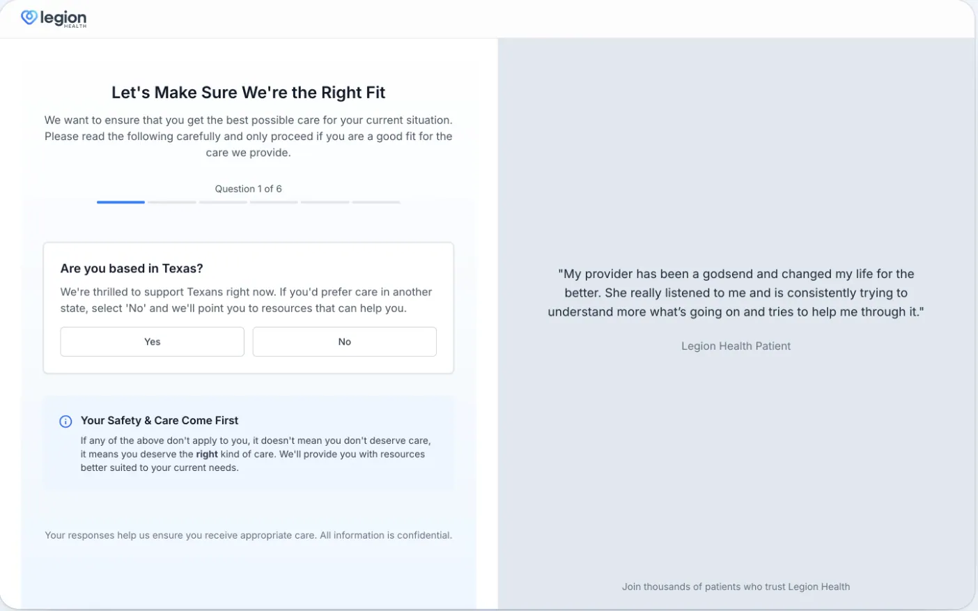
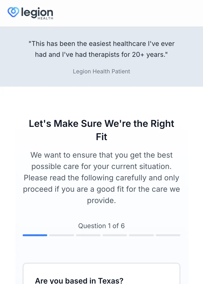
I’ll give them credit. The first version had a humongous quote on the right side, and on mobile it took half of the screen. That quote is gone now. The rest of the flow still needs work.
Is this a cybersecurity app?
First, I couldn’t tell if this was a cybersecurity app or a place to get help as a patient.
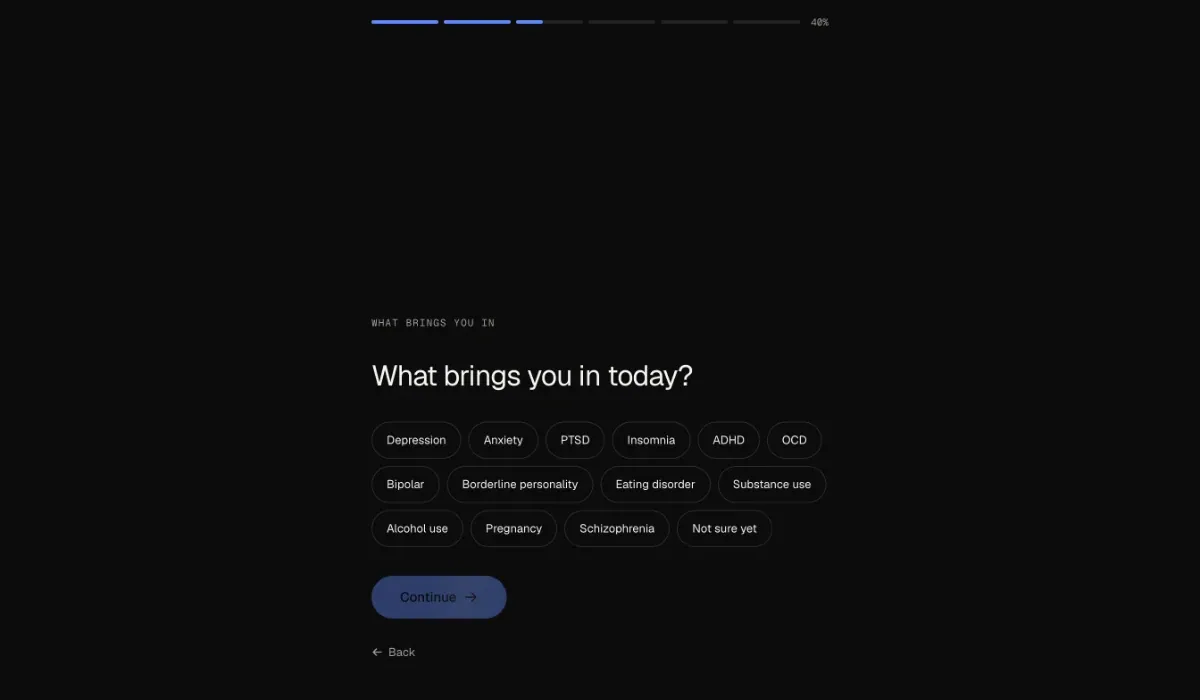
The first version was light. The new one is black, with tiny monospace labels in capitals and thin glowing blue bars. A label sits over almost every headline and repeats it: WHAT BRINGS YOU IN, then “What brings you in today?”
Do this: Use a calm, light page and type people read every day. A good headline doesn’t need a label above it.
Who is on the other side of the screen
This is someone looking for psychiatric help: anxious, depressed, living with ADHD. For them, a long, dark and unclear flow is depressing.
Look at the safety question. Under “Are you currently thinking about harming yourself or someone else?”, the numbers that matter most, 911 and 988, are small grey text.
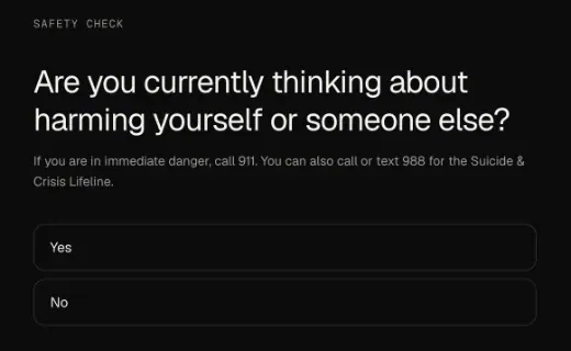
Do this: Make the crisis numbers big buttons you can tap, not small grey text.
Way too much, way too early
Onboardings are a never-ending A/B test, and this one still needs tweaking: way too much is asked ahead of time, there’s no proper progress, and it takes ages to complete.
Before you can book, it asks for your name, date of birth, sex, phone number, state and ZIP code, whether you’re thinking of harming yourself or someone else, any hospital stays, your conditions, your medications, permission to pull your medical records, a card, a photo of your ID and your insurance.
The account should come first
The account should have been created a long time ago. Start with the symptoms and a couple of things that matter. Then an email to save progress and create the account, or a Google sign-in, and done. Finish the profile after.
Continue is the only answer
One screen asks to pull your medical records from every doctor you’ve seen. The only button is Continue. No skip, no back. Another screen asks you to agree to texts, and one checkbox covers both texts about your care and marketing.
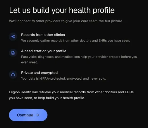
Do this: Put Skip for now next to Continue, and give marketing texts a box of their own.
What you can click isn’t clear
On a black background, nothing is clear about what is clickable.
The fields are a label and a faint line, with no box. A blue line under the title, “Psychiatric care by video, insurance accepted.”, looks like a link. Continue looks switched off on almost every screen until everything is filled in.
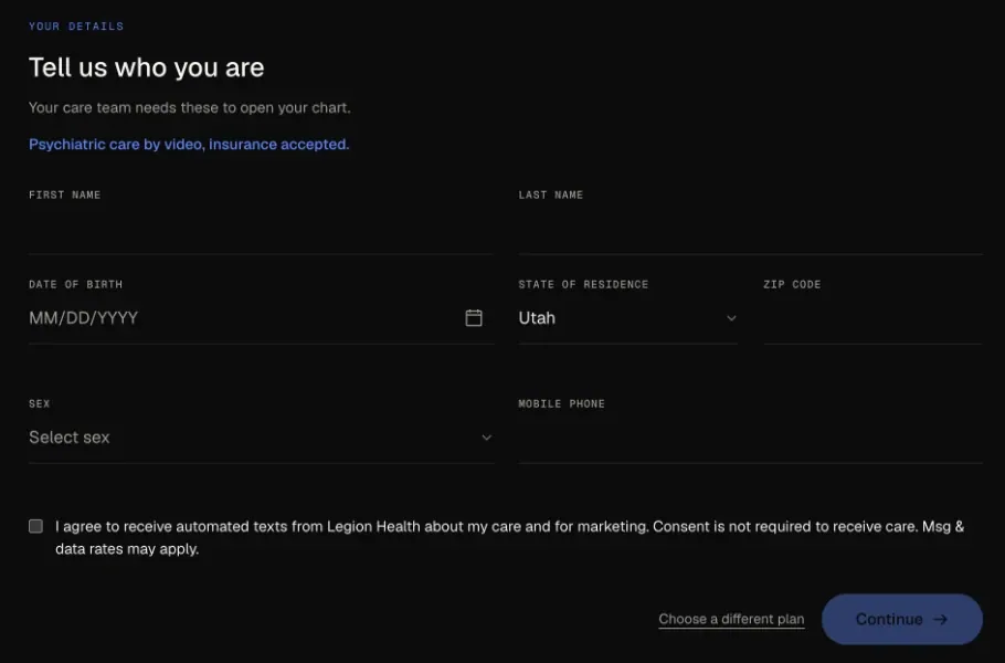
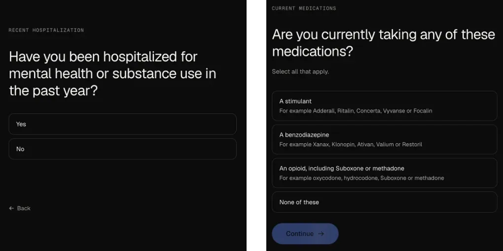
The answers don’t behave the same either. Tap Yes or No on the hospital question and you move on. The medication answers look exactly the same, but they wait for Continue.
And on the card page, Save card glows blue before a single card field is on the screen.
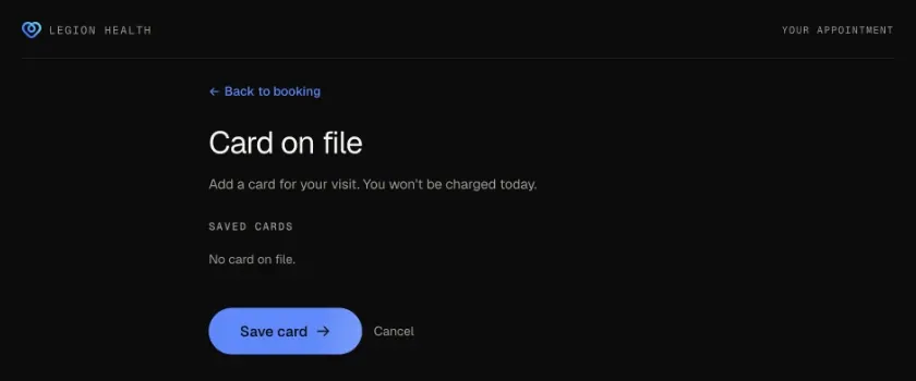
Do this: Draw fields as boxes and buttons as buttons. Keep Continue on, and when something is missing, show it on the field.
Long. Super long.
Long, super long, nothing moves fast.
The progress bar crawls two or three points per question: 35%, 37%, 40%, 43%. Then the confirm page says 94% and One last step. It isn’t one. A card, a photo of your ID and your insurance are still to come, each on its own page, and none of those pages has a progress bar.
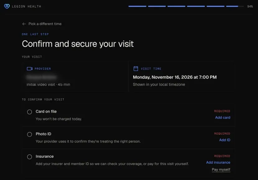
Do this: Near the end, count what’s left in words, like “Two more steps”. Never call it one last step when three are left.
One flow, five frames
One flow, five different page frames: logo and progress in one row, progress with no logo, logo on the left and progress on the right, logo and a page name with no progress, and nothing at all.
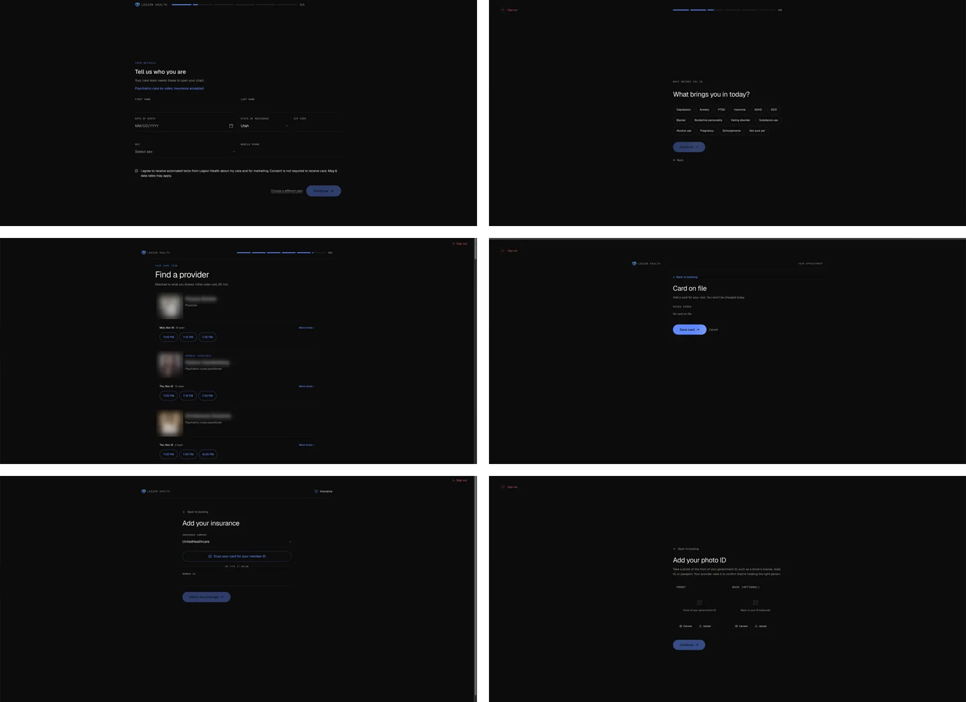
Sign out jumps between the top left and the top right, always in red, like an error. REQUIRED is red too, before you’ve done anything wrong. And the provider list says the first visit is 60 minutes, while the confirm page says 45.
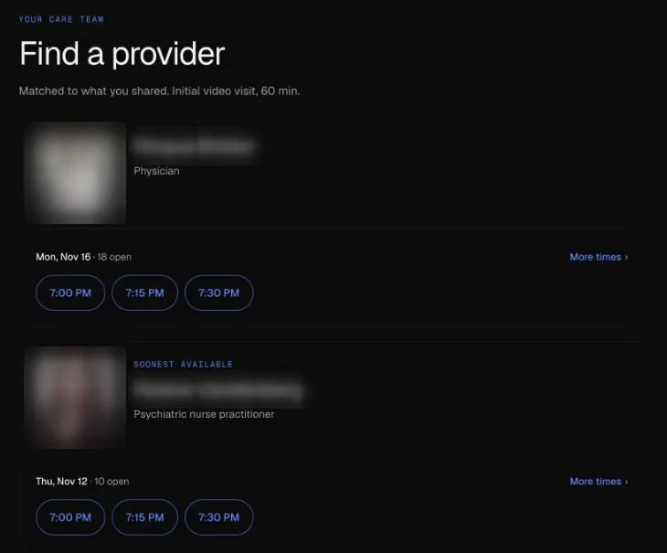
Do this: One frame for every step, one place for Sign out, and red only for real errors.
AI still needs direction
The main issue is that people vibe code these things, thinking AI will deliver great stuff.
AI can build a screen in minutes. It won’t decide what to ask first, what can wait, or what a person in a bad moment needs to see. I build in Claude every day, and I wrote about it in I Ditched Figma for Claude. It’s Not That Easy. The workflow is the same as before AI: define the problem, strip it down with questions, envision the flows, then build.

How I rebuilt it
I rebuilt their first onboarding as a concept in October, with that workflow, and built it in code. It walks the same path: a few questions to check it’s the right fit, what you need help with, insurance, a provider and a time, and payment last, on one page. No medical records and no photo ID before you’ve booked.
I started from their live page. The biggest thing on it was a patient quote signed “Legion Health Patient”, so nobody could check it. It became one named Google review under the first question, and the question got the whole page.
Each question gets the page with one short line under it, and everything stays in one blue. Picking a provider is quicker: a short bio, the rating and the next times by day, with the provider, the time and Continue held in a bar at the bottom. Near the end, progress says “Two more steps”.
When an answer rules you out, it gets a page of its own: what the answer means, services that can help, and Change your answer for a tap made by mistake. A risk of harm can’t wait, so that page leads with 988 as the only filled button.
On a phone, the question comes first, Yes and No sit right under it, and the booking bar stays where a thumb reaches it.
An onboarding is never done. You test, learn and change it. But the basics stay the same: ask only what matters first, show real progress, and let people in fast.